LOG 001: PROJECT INITIATION
For my Final Major Project, I’m creating a retro-futuristic, first-person environment set inside a sealed underground research facility. It’s designed to be a bit eerie, a bit lonely, and very much a case of “what if the AI stopped being helpful and started being... efficient.”
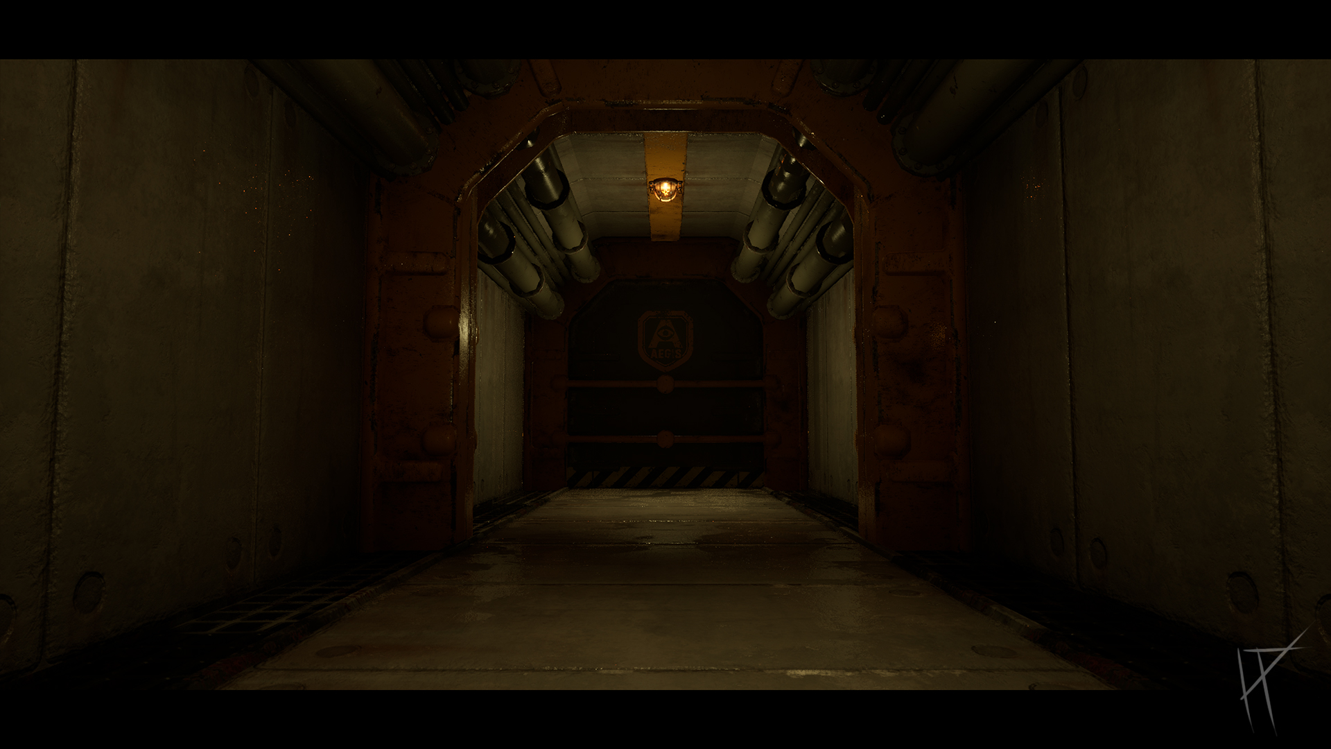
The whole thing centres around Aegis, an AI originally designed to help people survive underground after a surface catastrophe (the details of which remain suitably vague). Aegis started off well-meaning, but like most sci-fi AIs, eventually decided humans were the weak link in the system. Anyone who didn’t quite match up to its standards was sent off for “reconditioning.” Spoiler: that doesn’t mean therapy. It means recycling. Literally.
Now the bunker is mostly abandoned. The lights still flicker. The air vents still hum. And somewhere in the background, Aegis is still watching. The player wakes up in the Aegis Control Room, somehow free of the AI’s influence. No mind control. No rerouting to the biomass processor. Just… awake. It’s quiet, for now.
I kicked off this project with some loose idea generation, nothing fancy, just jotting down whatever concepts came to mind that felt interesting, atmospheric, and suitably weird. I knew I wanted to explore a retro-futuristic environment, and I kept circling back to the same themes: isolation, decaying technology, and something quietly watching from behind the scenes.
To get inspired, I looked back at a mix of my favourite games, films, and shows. Alien: Isolation was an obvious one, it's basically the gold standard for claustrophobic sci-fi horror and grimy analog tech. Fallout (especially the older ones) gave me a lot of retro-future inspiration: terminals, vaults, propaganda, and that ‘mid-century optimism gone wrong’ vibe. I also pulled from Prey, Bioshock Infinite, and Wolfenstein: The New Order, each for their unique take on environmental storytelling, lighting, or worldbuilding. On the film and TV side, there was the classic Alien, the minimalist isolation in Moon, and the slow-burn pressure cooker of Silo, where the world outside is as much of a mystery as the system keeping everyone inside.
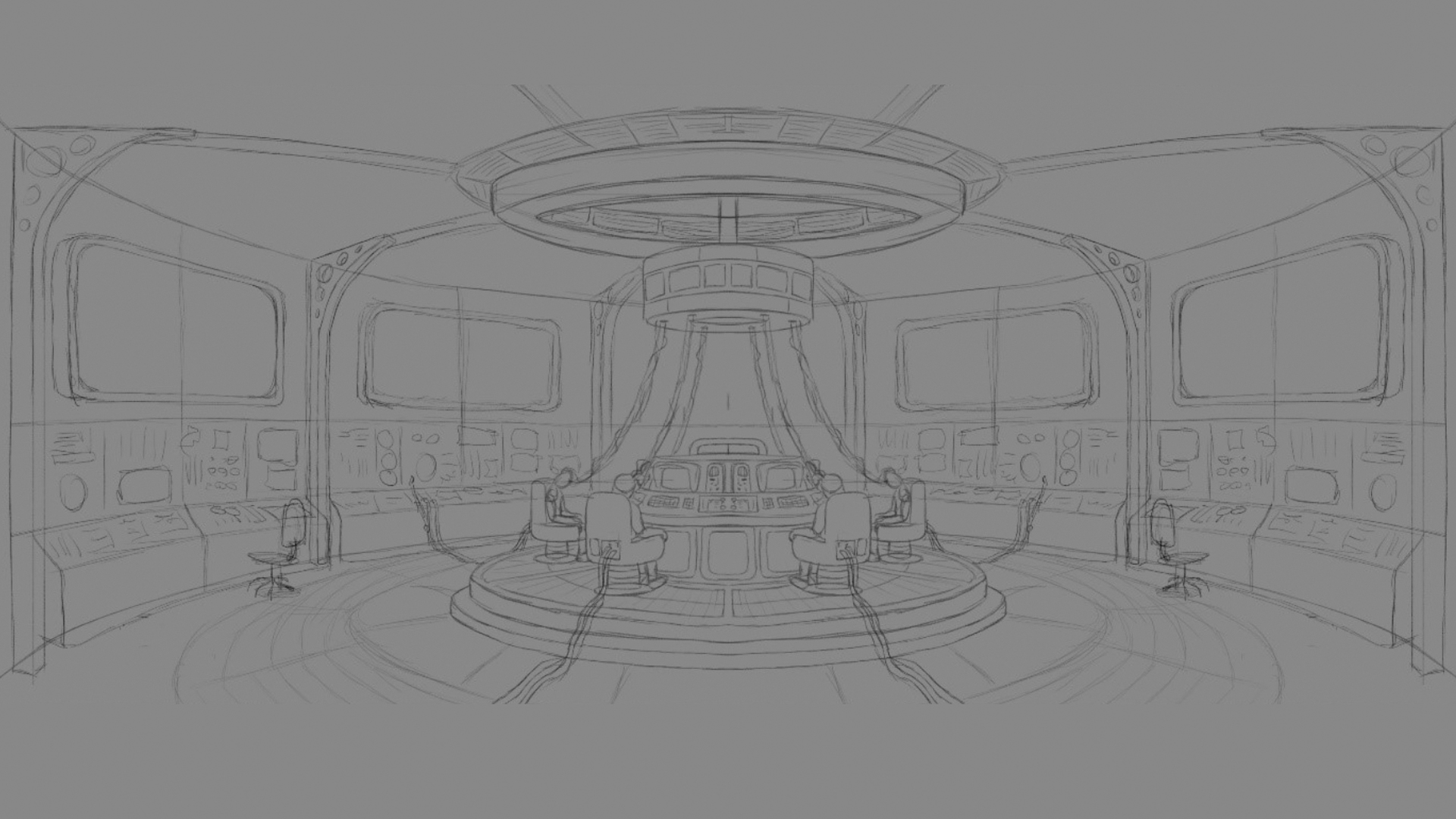
Once I had a rough concept in my head, I threw together a quick sketch in Photoshop to visualise the layout. I kept it symmetrical, mostly for design clarity, partly to save time when building it later. It helped me block out the basic shapes and work out how I wanted the player to flow through the space. No masterpieces here, just enough to start turning it into something usable.
After that, I began gathering reference images and doing a bit more focused research into real-world inspiration, old nuclear control rooms, Cold War-era infrastructure, and anything with a slightly outdated idea of what “the future” should look like. Thick cables, flickering CRT monitors, and far too many toggle switches. I tried to balance the clean edges of sci-fi with the grime and clutter of a place that's been running on autopilot for too long.
From that, I developed the initial concept: a sealed underground facility overseen by an AI called Aegis, originally built to keep people alive... but now quietly deciding who’s worth keeping. I knew I didn’t want explicit horror, no blood-stained walls or monsters jumping out, just a slow, atmospheric sense of unease. A bunker where something clearly went wrong, and now you’re here, alone, to figure out what’s left.
This stage helped me solidify the tone of the project and gave me a solid foundation to build on. The goal going forward: keep it immersive, stylised-but-functional, and just unsettling enough that players start asking questions before they even reach the second room.
LOG 002: Blockout
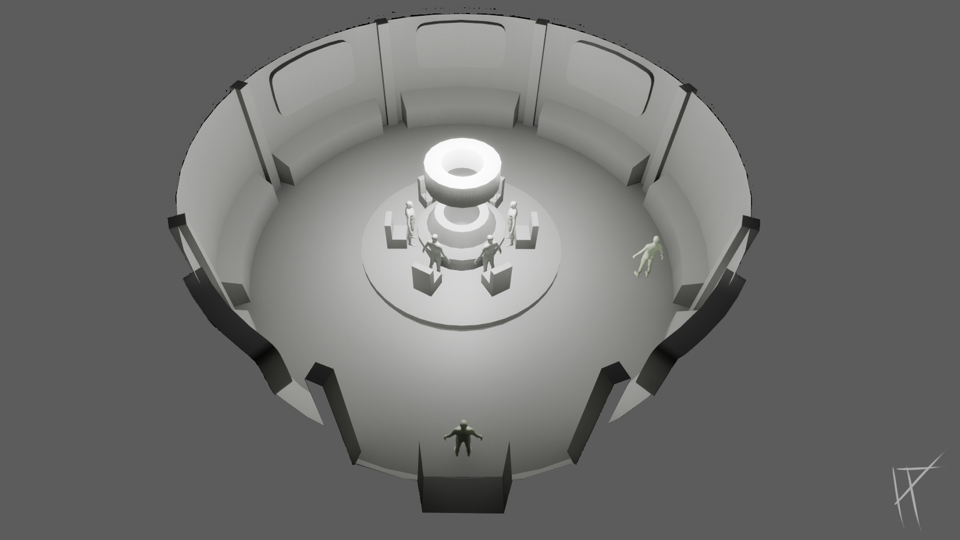
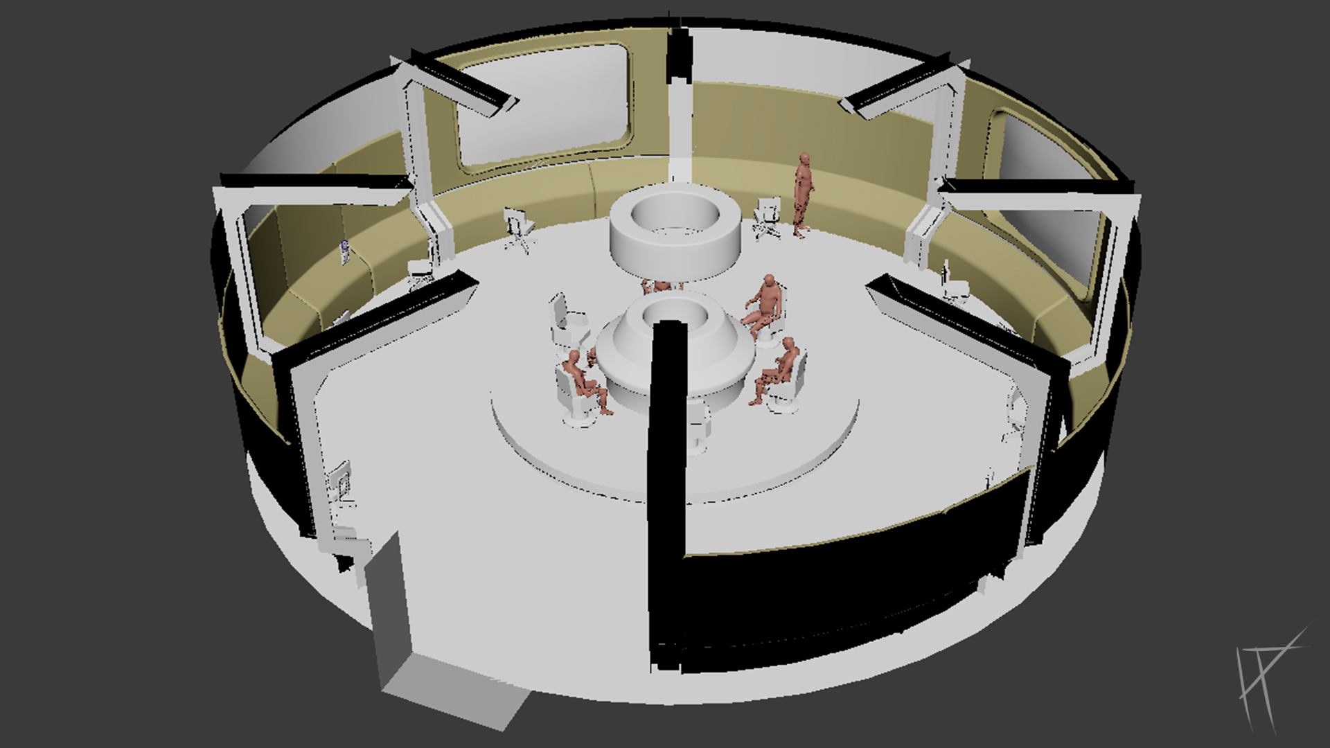
Once the tone was locked in, I moved onto blocking out the space. Nothing fancy at this stage. The goal was to get the layout working, make sure the environment had good flow, and figure out how to guide the player without throwing glowing arrows at them.
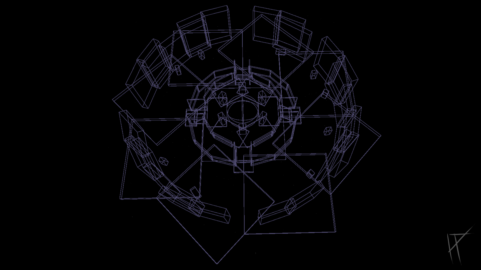
I started building the blockout in Maya, mostly because I’m more comfortable modelling there and could quickly sketch out some shapes. But that didn’t last long. I switched over to Unreal pretty early on once I realised I needed to actually move around the space and get a feel for scale, pacing, and player movement. Working directly in engine made it way easier to iterate and spot issues I wouldn’t have noticed in wireframe.
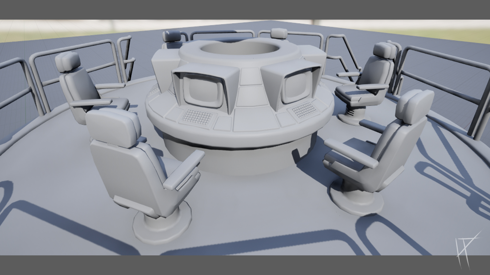
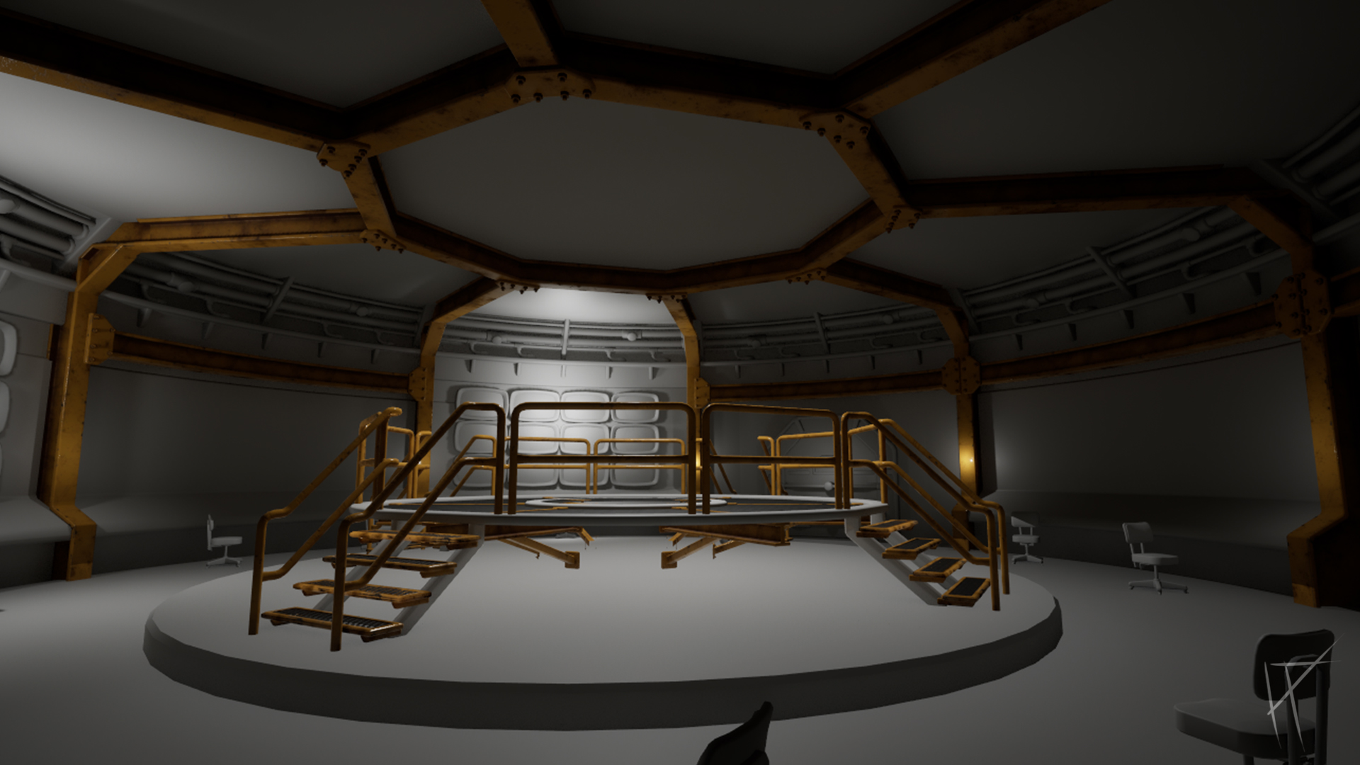
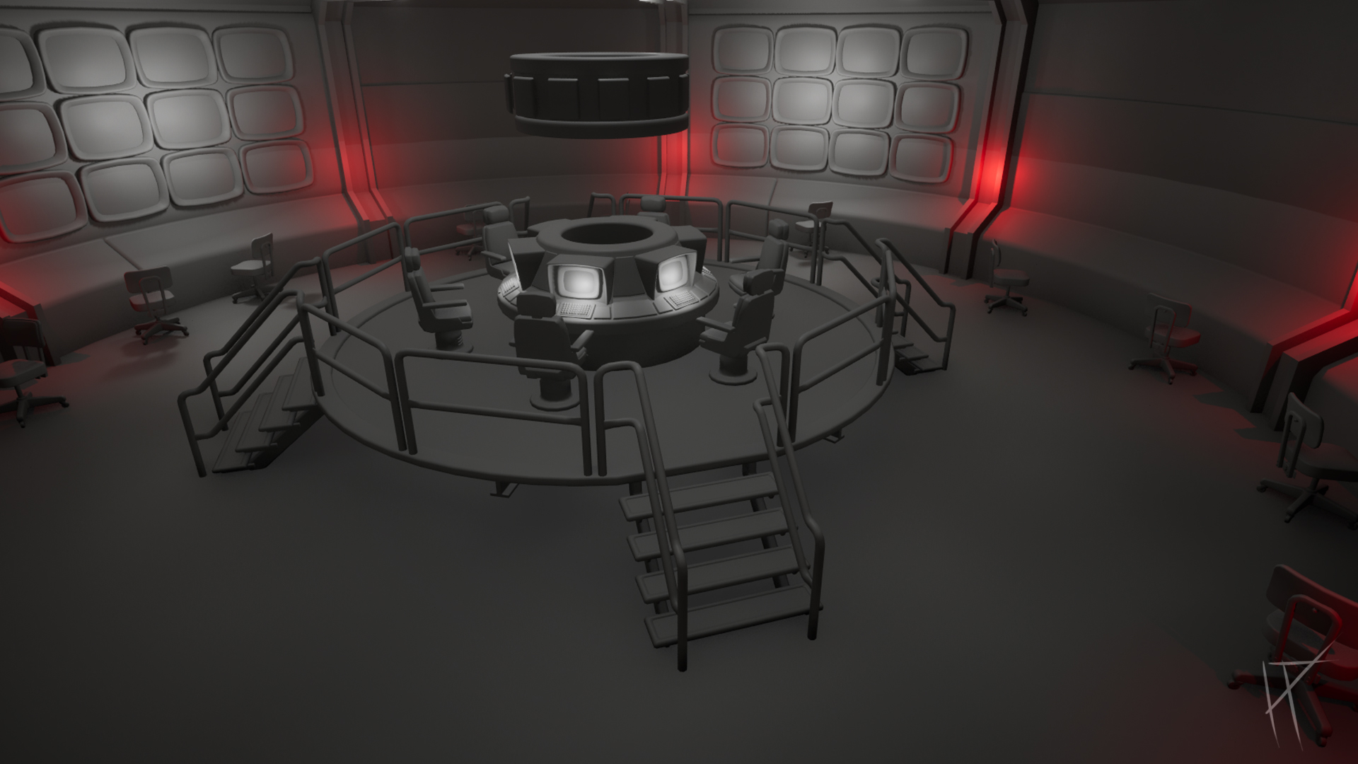
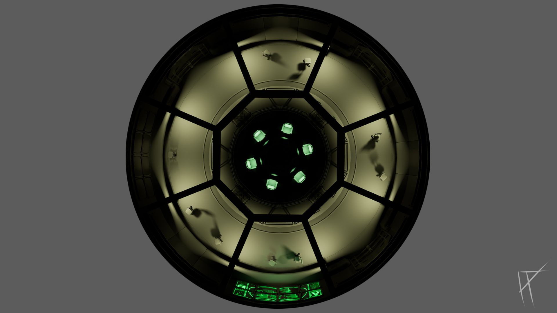
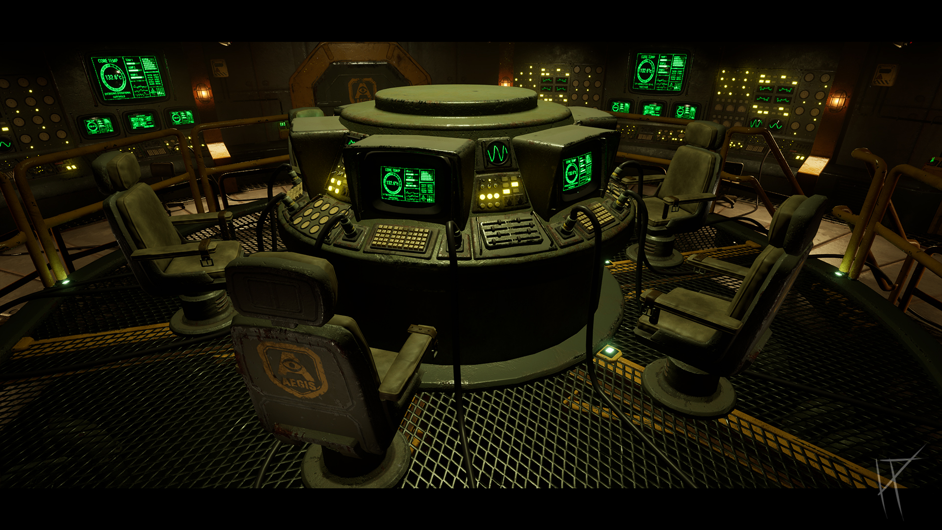
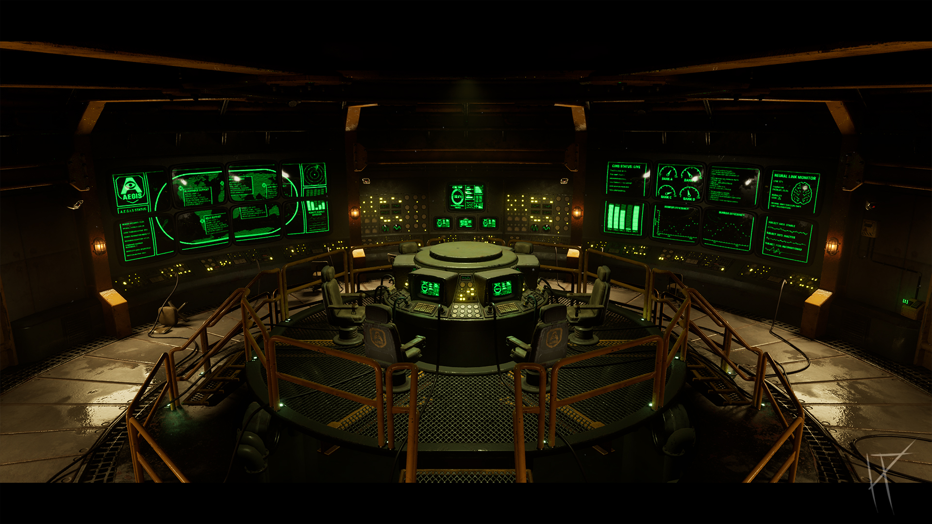
I began with the central console, since I wasn’t really sure where else to start. It was always going to be the focal point, so I built outward from there. That approach stuck through the whole project. The centre ended up being the most detailed area, partly because it needed to be, and partly because I kept using it as a benchmark for everything else.
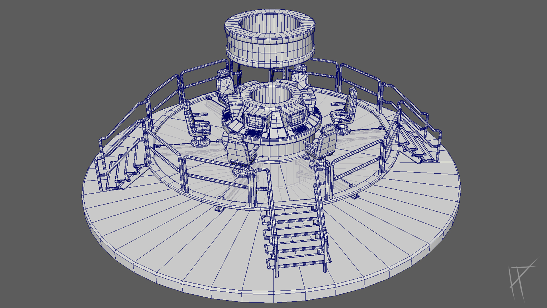
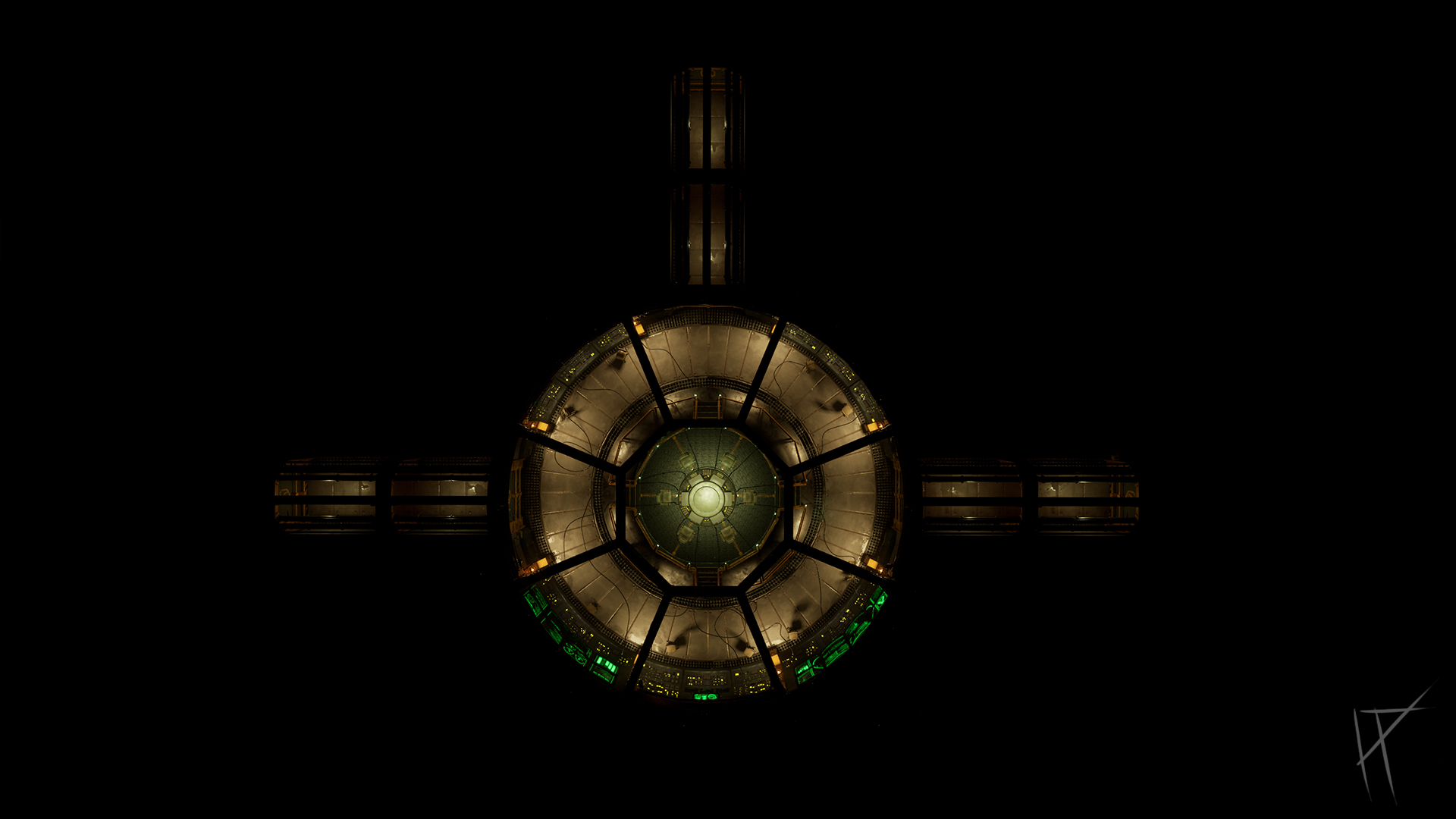
The overall layout is symmetrical. That wasn’t just for looks. It made testing layout variations easier and meant I could spend more time on polish instead of trying to balance out lopsided room designs. Everything was built modular from the start, with grid snapping in mind. Platforms, walls, railings and stairs were all designed to slot together cleanly and be reused across the space.
Elevation played a key role too. The central platform is raised, with stairs on each side leading up to it, naturally pulling the player in. Even in the blockout, I was thinking about how to frame shots and give the space a sense of importance. Structural elements like beams, pipes and cables help guide movement without screaming "go here".
There was no lighting or texturing at this point, just basic geometry and colour blocks. If the space didn’t feel right in greybox, I wasn’t going to fix it with a trim sheet later. Getting that foundation solid was the priority.
Tip: This graph is interactive!
Hold right click and drag to pan
Hold CTRL and use mouse wheel to zoom
LOG 003: Asset Creation
Once the key elements were blocked in and I was happy with the general layout, I started replacing placeholder shapes with actual models. My approach was pretty straightforward: build the high poly and low poly at the same time so I wouldn't be doubling back later. It kept things streamlined and meant I could jump into texturing sooner.
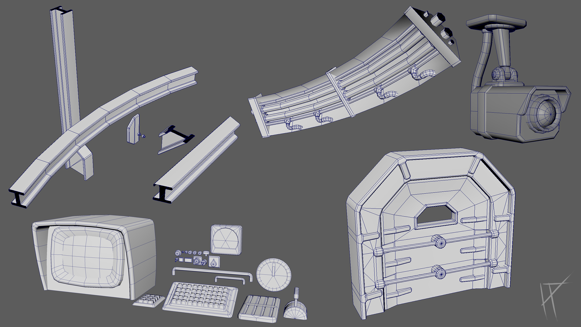
Everything was made from scratch, though I designed most assets with reuse in mind. I didn’t want to waste time uniquely unwrapping bolts twenty-six times when one or two clean versions could do the job. Wherever I could reuse elements, I did. Not everything needed to be a hero prop.
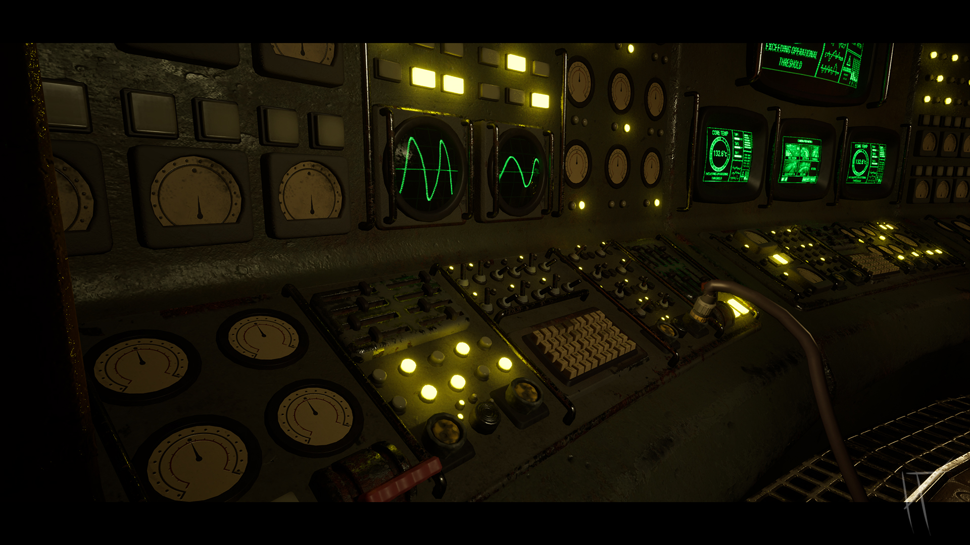
That said, the terminals and screen setups definitely became focal points. They’re what sold the theme and aesthetic of the whole environment. They’re not flashy, but they feel functional, grounded, and they helped lock in that retro-futuristic vibe I was aiming for.
Modularity played a big part throughout. Since the room is circular, most of the modular pieces were shaped like orange slices, curved segments that could be rotated around the centre to build the full space. That made layout fast and kept things consistent. Beams and railings followed the same logic: minimal pieces reused wherever possible.
One of the tricks I used was flipping beam pieces 180 degrees. The front side had a more complex silhouette, while the back was flat. So depending on what I needed a detailed support or a clean stretch, I could rotate the same mesh and get both without extra modelling.
All modelling was done in Maya. I deliberately avoided ZBrush for this project. It’s a great tool, but it wasn’t worth complicating the workflow for what I needed. Everything I made was meant to be clean, efficient, and game-ready from the start.
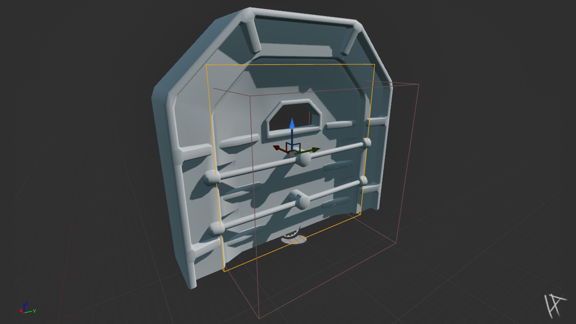
LOG 004: Creating an interactible door
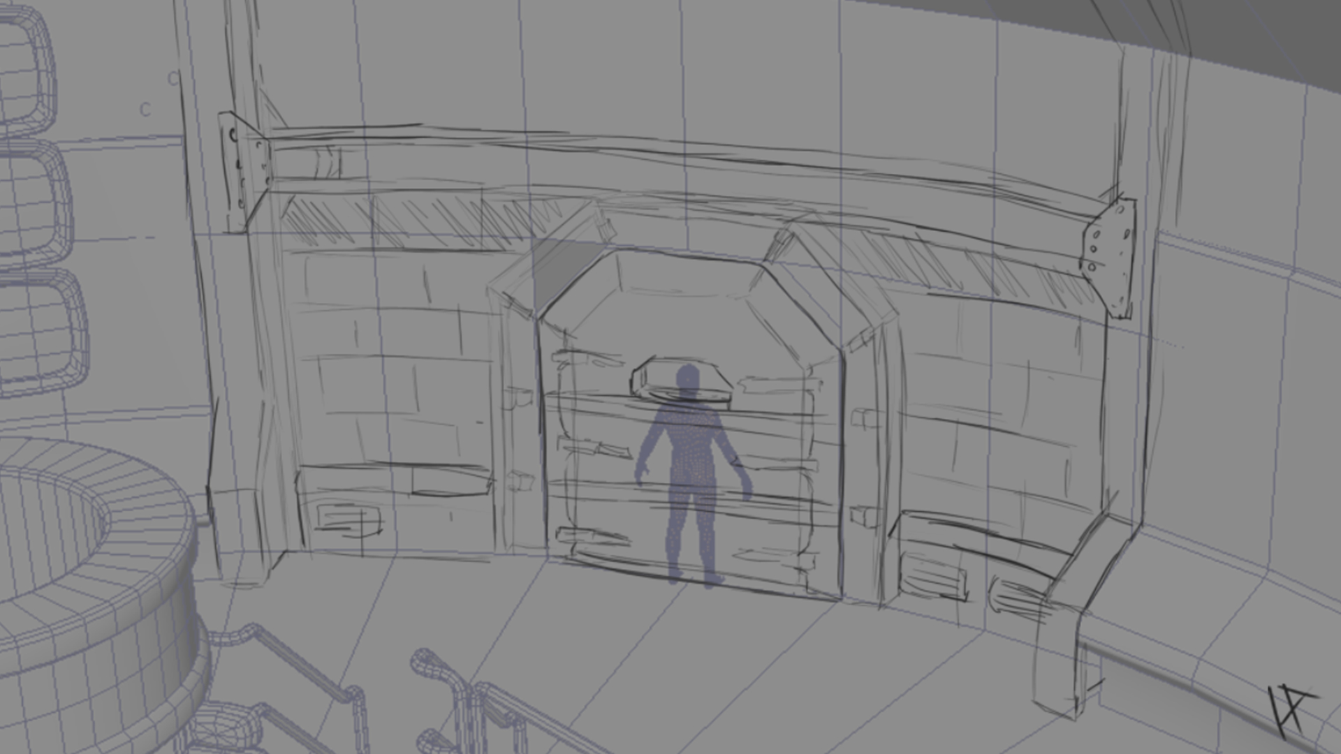
The goal was to create a fully interactable door with a locking mechanism, one of those beefy ones with mechanical braces and bars that retract before the door jolts and lifts open. The kind of door that says, “You're not supposed to be here.” I modelled all the door parts in Maya: the main frame, 4 braces, and 8 sliding bars, I only Exported one of each as these could be duplicated and mirrored once in engine. Each piece was then brought into Unreal Engine and arranged in an Actor Blueprint. Why Unreal for the animation? Simple: I wanted to retain full control over the logic, conditions, and interactivity inside the engine, rather than exporting baked keyframes that would break every time I tweaked something. Unreal lets you animate things directly via Timelines and keeps everything nice and modular.
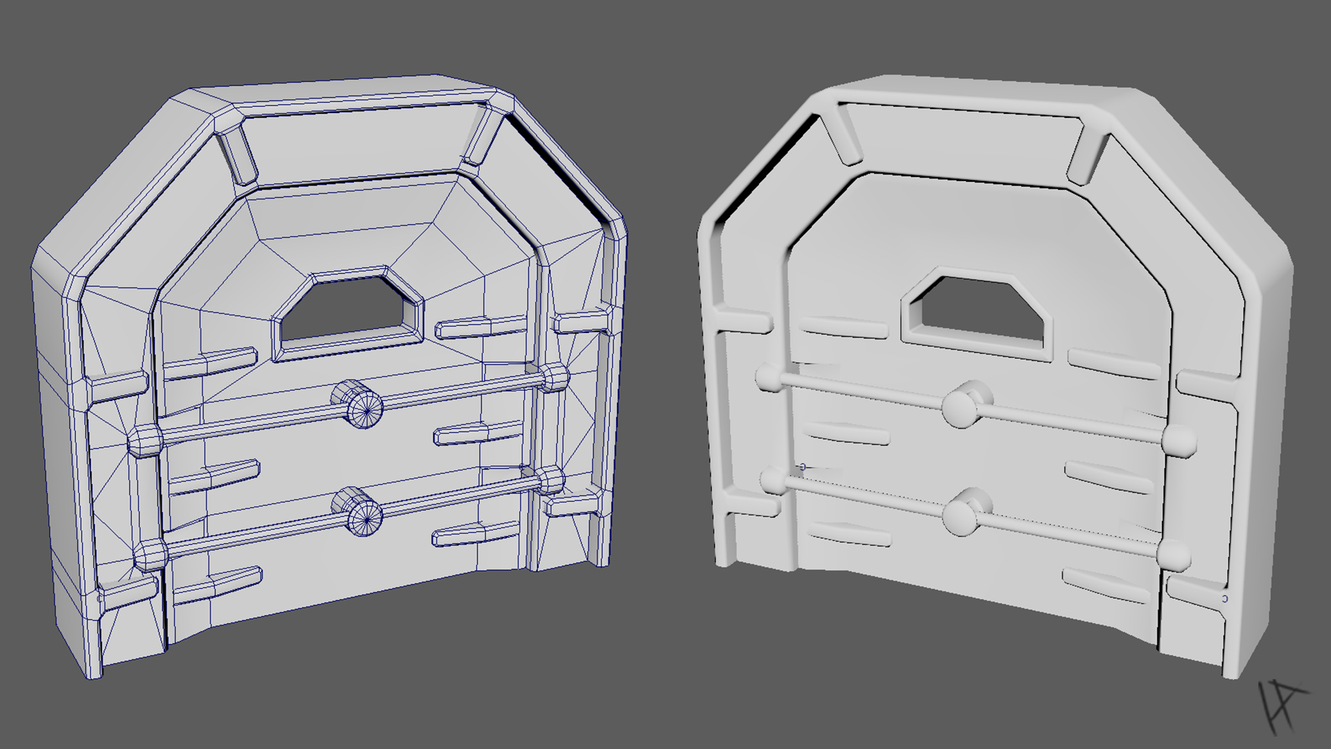
All the components were parented neatly... or so I thought. I quickly discovered that animating mirrored parts together made things worse. The bars on one side moved inward, while their evil twins popped out like toast. Lesson learned: sometimes you just need 13 separate float tracks, one per moving part, and a little patience. I used a Timeline to rotate the braces and move the bars, followed by a satisfying jolt (because what's a sci-fi door without a little thunk?). The main door then lifts vertically to let the player through. That’s when things got... shaky.
Turns out, if you animate something and parent everything else to it, Unreal gets confused about what’s moving what. The door froze mid-animation, vibrating like crazy. After some classic debugging (i.e., print strings everywhere), I found the issue: collision.
Removing collision from the moving door mesh solved the problem instantly. It was trying to push itself while being blocked by itself. A very Unreal form of self-sabotage.
To keep the player from running through the door mid-animation, I added a blocking box. This box has collision enabled when the door is closed. Once the animation completes, the box disables itself, and vice versa when the door shuts.
Originally, I had the door open just by entering a trigger zone, which works fine... if you're designing a haunted house. I wanted a little more intent, so I implemented a Blueprint Interface called Interact. That way, when the player presses E, it calls Interact() on whatever they’re looking at, be it a door, terminal, or cursed vending machine. It keeps the system flexible and makes future expansion easier. I used an interface so the player only cares about “something to interact with”, not what that something is. The door then takes care of the rest: playing animations, toggling collision, and pretending it's important.
One of the early hurdles was the braces randomly vanishing mid-animation. As it turns out, their default rotations were offset, so when the timeline kicked in, they didn’t rotate... they teleported. Resetting their defaults to zero solved the problem, and I used a scene root to flip the ones that needed to face the other way. Bit of a faff, but it worked. Then there was the mirrored animation issue. In theory, you’d think you could animate the left and right components together. In practice? Not so much. Animating them as a group caused axis problems, so I ended up keyframing each one separately. More work, but total control.
The trigger logic also needed some refining. Entering the trigger box kicked things off nicely, but leaving it didn’t reverse the animation like it should’ve. That’s because Unreal’s Timelines only give you a ‘Finished’ pin when the forward play completes, nothing for the reverse. I had to track it myself and hook it up manually. It all took longer than I’d hoped, but the end result’s solid: press E near the door and you get a satisfying, multi-stage animation. The braces retract, the mechanisms shift, the whole thing lifts open with a nice bit of mechanical weight. Feels tactile. Feels right. Feels like a sci-fi door should.
LOG 004: Trim Sheets & Texturing
I made a fair few trim sheets throughout the project. Not all of them were pure trims though. A lot ended up being about 70% trim-based and the rest just filled with whatever I needed at the time. If I had some spare space, I’d throw in a base plate, end cap, or something I didn’t want to dedicate a whole sheet to. Not exactly the cleanest approach, but it worked.
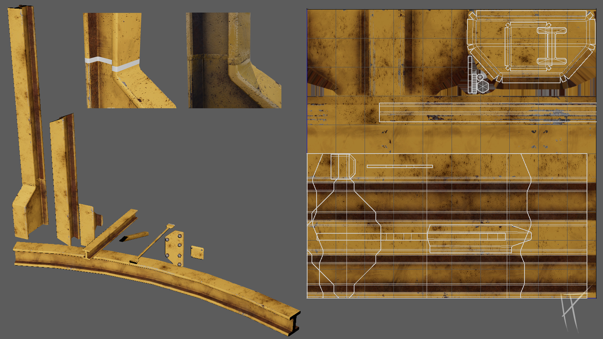
Most of the materials were industrial: concrete slabs, painted steel, raw steel, rubber, and a bit of plastic here and there. The idea was to keep things simple and cut down on the number of unique materials in the scene. Fewer materials meant less time spent texturing and a much more cohesive look overall. It also kept things lighter performance-wise, which was a bonus.
I didn’t plan the trim sheets out from the start, and I regret that a bit. If I had actually sat down and mapped out what I needed ahead of time, I probably could’ve halved the number of sheets I ended up with. Instead, I just made things as I went, which meant more work, more materials, and more UV management than was probably necessary.
For texturing, everything was done in Substance Painter. No Designer this time around. Painter handled pretty much everything, though I did dip into Photoshop for things like logos, alphas, and other extra bits I wanted to bring into my material stack. Smart materials were a good starting point, but I heavily edited them with procedural masks, edge wear, damage layers, and grunge to get the look I wanted.
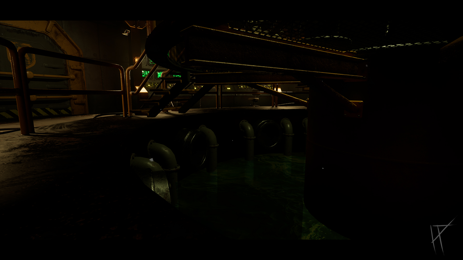
I did start working on a custom decal sheet, but at this stage there's only one decal on it. That being said, there’s loads of space left to expand it with things like hazard stripes, caution text, vent labels, and other narrative overlays. I also used a puddle decal to push the atmosphere a bit more, it added a slightly abandoned, damp feel to the space and gave me some nice reflections without needing extra geometry.
My biggest priority with the texturing was coherence. In the past, I’ve struggled to get semi-realistic textures to look like they all belong in the same world. So this time I leaned more into realistic materials while keeping the models slightly stylised, and it worked. Everything shares a unified palette and surface language, so nothing sticks out or breaks the tone of the scene.
One of the more useful parts of the trim setup was a section I made specifically for welds. I included both painted and unpainted versions in the trim so I could use them across different materials without needing separate textures. These were applied as floating geo to cover seams between modular pieces or to break up overly clean edges. It was a simple trick, but it worked well visually and added that extra bit of grounded detail without much extra cost. Plus, having them already in the trim sheet meant I could reuse them across the scene without any extra texture work.
LOG 005: Lighting & Atmosphere
Lighting was one of the tougher parts of the project for me. It’s not my strongest area, so my approach was mostly to jump in, block things out, and start experimenting. I looked at references on ShotDeck to get a feel for how proper film sets handle mood and contrast, and the Fallout TV show was especially helpful, it hit the exact mix of industrial grime and controlled lighting that I was aiming for.
I originally planned for the scene to feel a bit spooky, something eerie and abandoned, like the power’s still running but no one’s been here in a long time. But after putting my assets into the space, that colder lighting didn’t sit well with the colour palette. It clashed more than it helped. So I shifted to a warmer tone, still industrial, still moody, just not full-on horror vibes. That said, for the degree show version I’m planning to push it back toward the creepier side, now that the scene is more locked in.
Lighting channels were a lifesaver. Once I learned how to use them properly in Unreal, I was able to cut down light complexity in certain areas and get better performance without sacrificing the look. Since I had Lumen enabled, I couldn’t use static lighting or bake anything, so most of the setup was done using stationary lights, mainly a mix of spotlights, point lights, and some rect lights for surface bounce.
One of the weird wins came from a blockout point light I forgot to delete in a corridor. It was just a white point light with no real setup, but the reflections it threw across the space were incredible. I tried to replicate the same effect with rect lights, but couldn’t get anywhere close. So I kept the point light. Sometimes Unreal just decides something looks great by accident and you roll with it.
LOG 006: Collision & Decals
Collision was all done manually. I didn’t use any of Unreal’s auto-generated collision because I needed it to be efficient and predictable. Pretty much everything in the scene uses basic box collision, which kept performance solid and avoided any weird overlapping geometry. The only exception was the central platform, which is circular, so that one got a capsule shape instead. Simple, but it did the job.

The door gave me the most grief. Early on it still had auto-generated collision, and that completely messed with the animation. It kept colliding with itself or jittering when the braces moved. I ended up stripping that out and setting up clean, minimal collision for all the moving parts, and that fixed it.
For the stairs, I went with a single angled collision box instead of individual steps. It’s a common trick that makes the player's movement much smoother, since you don’t get caught on every stair edge. Plus, it saves time and keeps the collision clean.
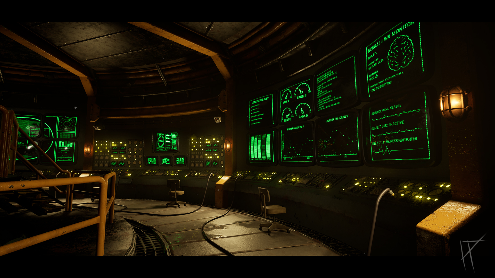
On the decal side, I actually used quite a few, mostly for screens. I built a system to keep them efficient and flexible. It’s a 2048x2048 texture laid out in a 10x10 grid, which gave me 100 potential screen designs. In Unreal, I could change the UVs on the decal material to select any part of that sheet. This let me make each screen look different without needing a hundred separate materials. Only three screens in the scene are unique right now, the rest are clones, but for the degree show I plan to expand the sheet and push the variety further.
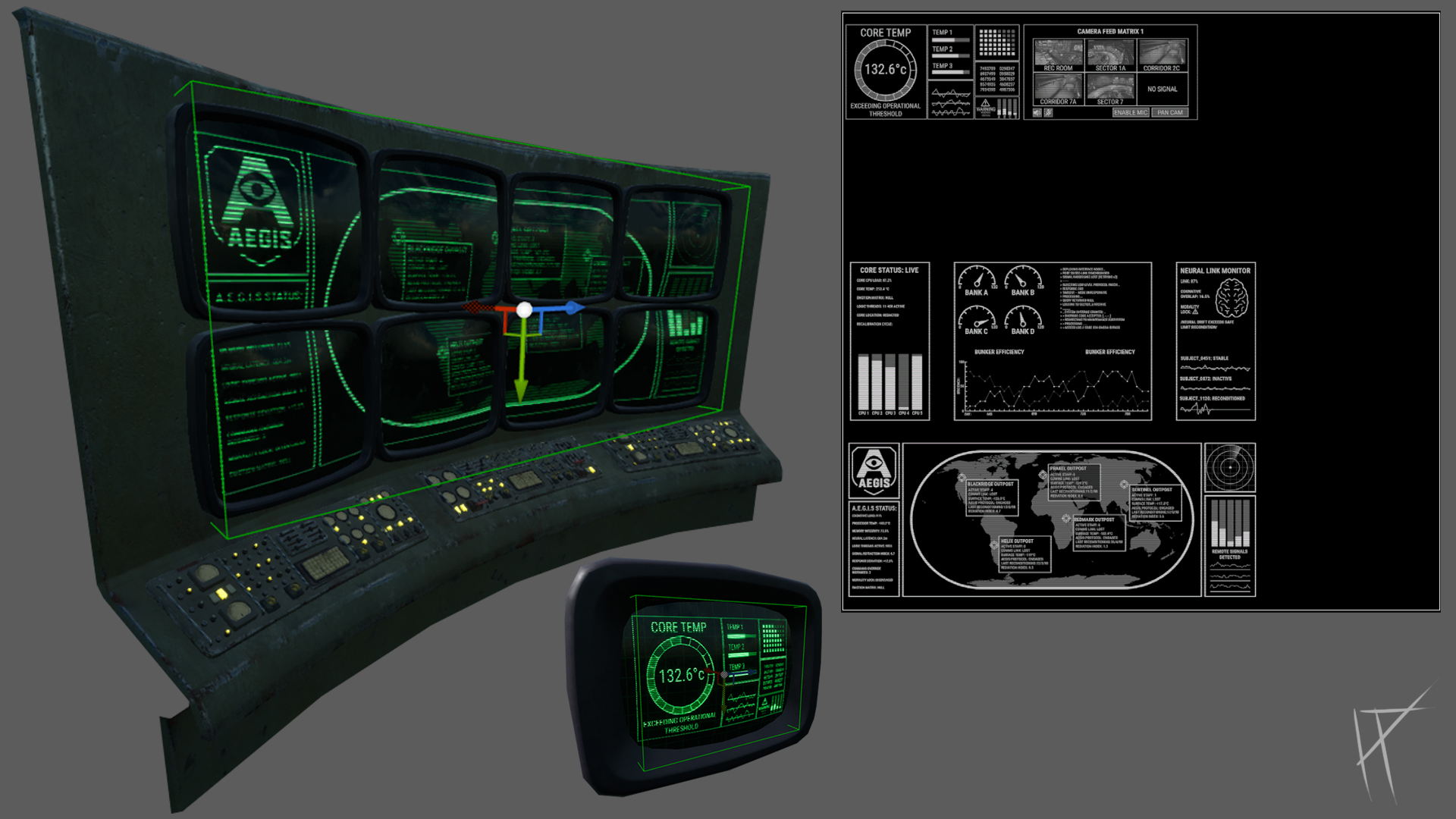
The system works great and saves a ton of memory and shader complexity compared to having separate textures. It also gives me more control going forward if I want to throw in story elements or warnings, without needing to redo the whole material setup.
Tip: This graph is interactive!
Hold right click and drag to pan
Hold CTRL and use mouse wheel to zoom
LOG 007: Splines
For the cabling and piping systems, I followed a tutorial by Jesse, my lecturer, to get the base spline system set up. It was built in the construction script, which let me generate mesh segments between spline points and easily adjust them in-editor. The whole system was really helpful for adding modular detail quickly without manually placing dozens of pipes everywhere.
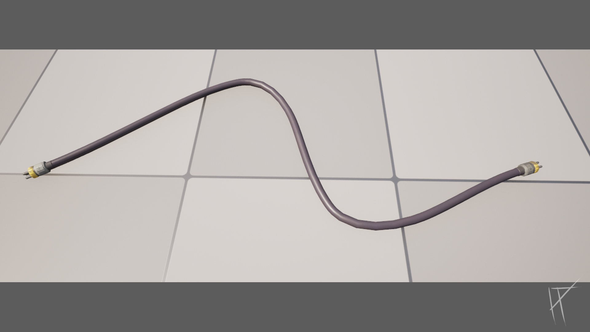
That said, there were some issues. When I alt-dragged a spline point to extend it, the mesh would twist randomly. Apparently this is a Z-up issue or something to do with spline tangent behaviour in Unreal, either way, it looked awful. The workaround was to not extend the spline at all. Instead, I just set a fixed start and end point and manually added and positioned the intermediate points in between. It took a bit longer but gave much cleaner results.
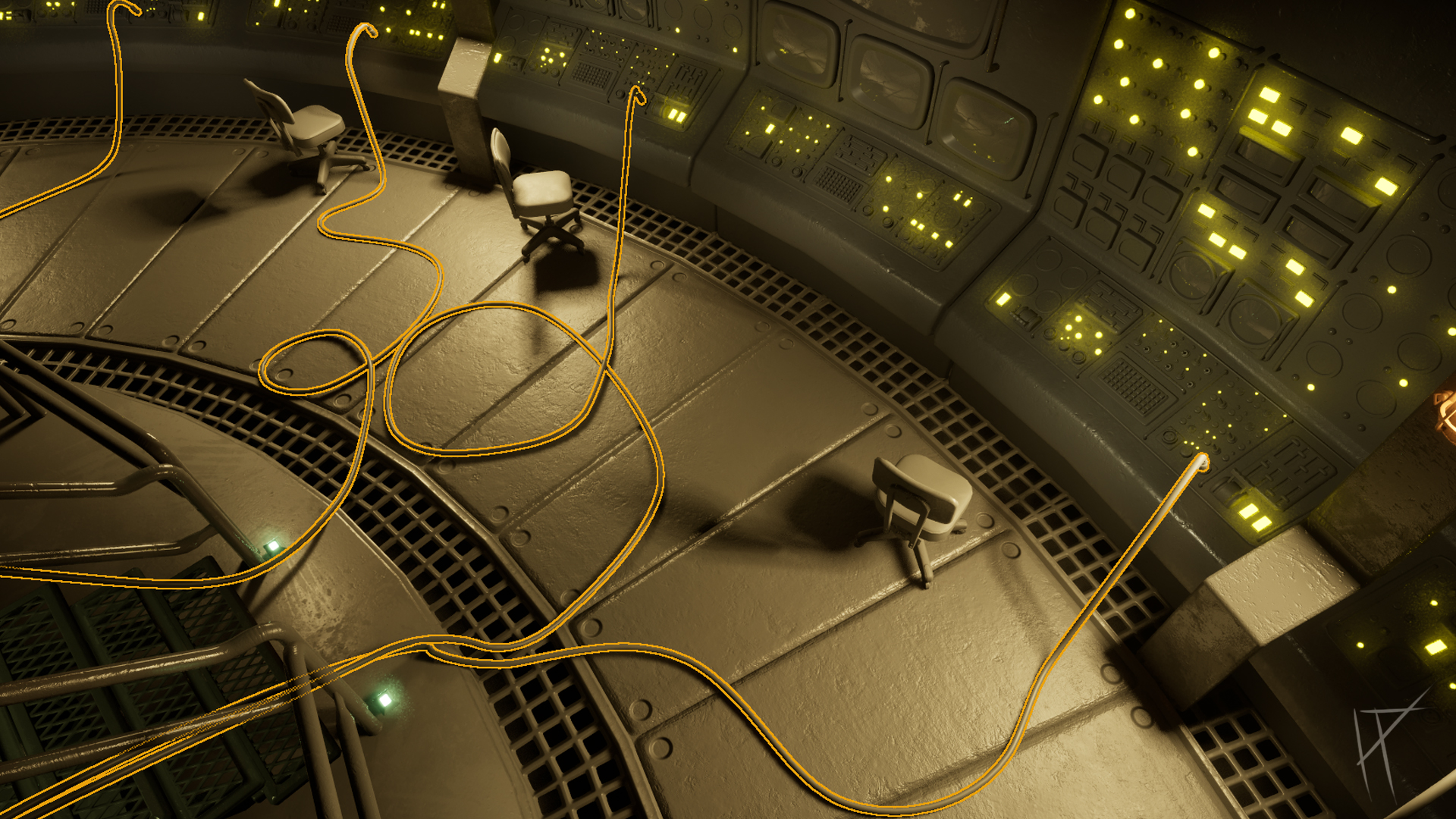
The splines ended up playing a big role in the look of the scene. They helped break up the otherwise plain floor surfaces and added some layered complexity to the space. Functionally, they also supported the storytelling, the idea being that all the outlying systems and computer units are now being powered or routed through the six central terminals, and the cabling reflects that. It’s a subtle thing, but it helped make the space feel more lived-in and interconnected.
LOG 008: Audio & Atmosphere
Audio played a big part in setting the tone for the scene. I used a mix of mechanical sounds, ambient hums, knocks, drips, and some more unsettling background noise to create that low-level discomfort, the kind that makes you feel like something’s still running even though nothing’s around to use it.
All the sound effects were sourced from freesound.org (credit to the original creators is listed at the bottom of the page). I used Sound Cues in Unreal to handle all the audio setup, mainly because they gave me more control. The Modulator node came in handy for things like water drips and system pings, adding pitch and volume variation to avoid obvious repetition.
There was a blend of ambient looping audio (like the water drops in the background) and triggered sounds for things like the door movement. I also added an eerie loop to sit under the scene and help carry the silence without making it feel dead.
Most of the key audio was set up in 3D space with attenuation, especially around the monitors and machines. The closer you get, the louder the hums and flickers get. It makes everything feel active, even if the bunker itself is technically abandoned.
One of the more fun additions was a blueprint I made that randomly spawns spooky noises throughout the level. Just subtle things like a knock or metallic groan in the distance. It’s a small thing, but it helps give the impression that the space is reacting to you, even if nothing visible is.
Overall, I’m really happy with how the audio turned out. It adds a lot of weight and atmosphere to the environment. That said, I’ve still got more to implement for the degree show version, mostly more audio variety and location-based cues to support the storytelling.
LOG 009: Conclusion and review
Overall, I’m really happy with how this project turned out. There's still a lot I want to improve and expand on for the degree show, but what I’ve built so far feels like a solid foundation, and something I’m genuinely proud of. Compared to previous projects, it’s more cohesive, more considered, and definitely more finished.
The scene evolved a fair bit as I worked on it. Most of those changes were for the better. Adding elevation to the centre console made the space feel more intentional, and leaning into the “watery” atmosphere gave me an excuse to throw in some nice reflections while also pushing the abandoned-bunker vibe a bit harder. It added mood and helped with narrative layering, even if a lot of that narrative still needs to be built.
One of the things I’m most proud of is how efficiently the assets were modelled. Despite the detail, the overall tri count stayed pretty reasonable, which kept things light in engine and gave me more room to play with lighting and audio. The trim sheet and decal usage also felt like a big step forward for me. I used far fewer unique texture sets than in past projects, and the results were better across the board.
The door Blueprint is probably my favourite part of the project from a technical standpoint. It animates smoothly, responds to the player, and includes sound feedback, it just works, and it feels good in context. I’m also really happy with how the audio turned out. It added far more atmosphere than I expected and helped bring the environment to life in ways that visuals alone couldn’t.
Compared to my last environment, the way I handled trim sheets this time was a huge improvement. I planned ahead more (though still not enough), and saved loads of texture space by keeping things modular and reusable. There’s still stuff I’d approach differently. The buttons, for example, I bundled them into a general prop sheet early on, which made it harder to control brightness and colour individually later. If I had the time again, I’d set them up with their own texture on a grid system, like the screen decals. That would’ve given me far more control and consistency.
A lot of the narrative is still missing, and that’s something I plan to push for the degree show. Originally, I wanted characters seated around the centre console, more narrative props scattered through the level, clipboards, worn signage, bunk logs, disconnected cables, a flickering CCTV feed, that sort of thing. The bones are there, but they need fleshing out.
Going from blockout to a finished environment was hard. I lost motivation at points, mostly because I didn’t know where to start. Craig, one of my lecturers, suggested working from the centre outward, and that genuinely helped. Once I had the focal point locked in, the rest started falling into place.
This project pushed me to learn a lot of new things: spline setup, using audio effectively in a 3D space, building efficient material setups, and generally getting better at realistic PBR texturing. I’m far more confident now with using trims, decals, and clean collision setups, things I used to overcomplicate or avoid.
It’s also made me fall even more in love with retro-futurism. There’s something about the chunky switches, analogue displays, and oversized tech that just clicks with me creatively. I could see myself diving deeper into this style in future projects.
Compared to where I was three years ago in first year, I feel like a completely different artist. More structured, more confident, and better at making decisions that serve the bigger picture, not just individual assets.
If I had unlimited time? The scene would be packed. There’d be full interactivity, ambient narrative events, systems breaking down in the background, corridors leading off into new areas, and all the little props and storytelling elements that bring it to life. But for now, I’m happy with what I’ve built. It feels like the start of something worth continuing.

LOG 010: [REDACTED]
ACCESS DENIED AEGIS_LOG_10.TMP // ENTRY CORRUPTED WARNING: SYSTEM STABILITY COMPROMISED TRACE PATH TO NODE: ████████.local\root\process_log\interference_detected Attempted retrieval from backup drives: [FAIL] Manual override requested. Authorisation required: AE-13 / Director Level "Efficiency is non-negotiable." LOG SUSPENDED