The Captain's Table
Introduction
The Captain's Table project is a dive into one of my all-time favourite aesthetics: retro-futurism. Ever since watching Alien as a teenager, I’ve been hooked on the charm of sci-fi from that era. There’s something about its clunky, functional design paired with sleek, futuristic elements that makes it so much more fun and visually interesting than modern takes on the future.
For this project, I’m aiming to create a scene that feels grounded yet subtly unsettling. The environment should tell a quiet story, with details like warning lights or cryptic messages on screens hinting at a bigger narrative. It’s not blatantly horror, but there’s an eerie vibe just beneath the surface.
I don’t usually enjoy creating my own concepts from scratch, as I tend to overthink and end up redesigning halfway through. It’s a bad habit that’s cost me time in the past. This time, I’m determined to work smarter by spending more time in the research phase to nail down a clear concept before diving in. That said, I did explore a few different ideas before settling on this one, and it feels like the right choice.
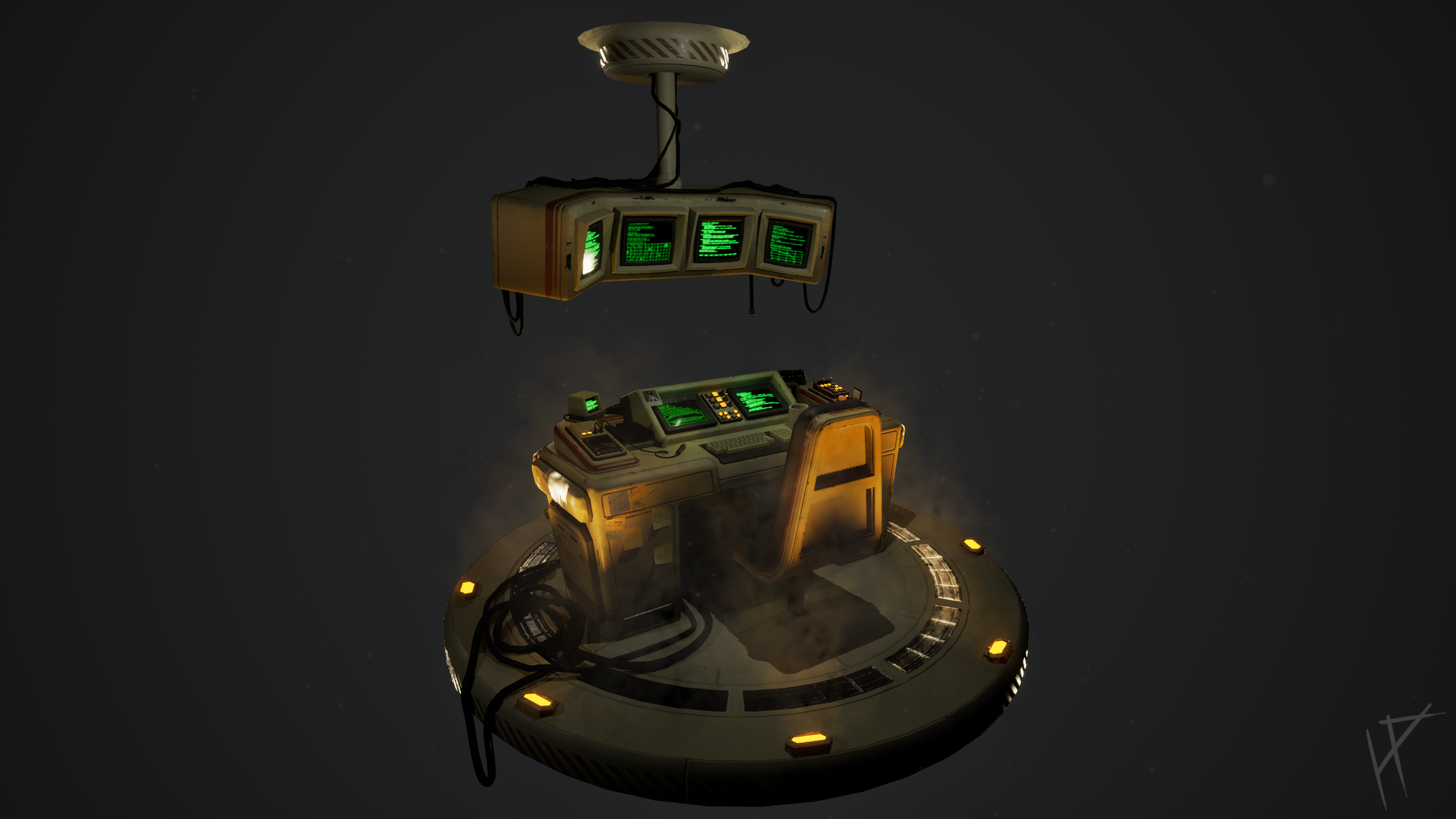
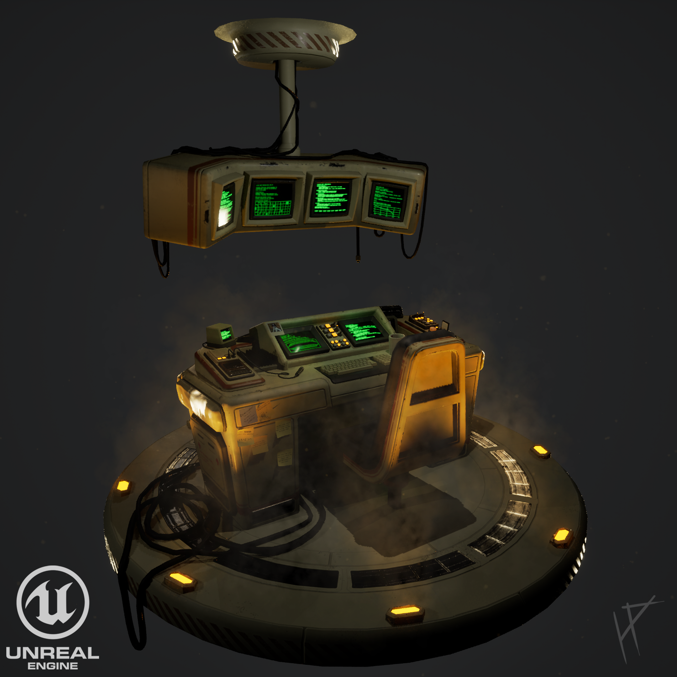
Design-wise, I’m approaching the scene with a sense of logic and purpose. Even though it’s set inside a spacecraft, the focus isn’t on sleek, modern minimalism but on a lived-in, functional space. This is the captain’s domain, so while practicality comes first, there’s room for personality and small comforts. The desk is the heart of the scene, and I’m excited to infuse it with details that tell a story.
Reference & Research
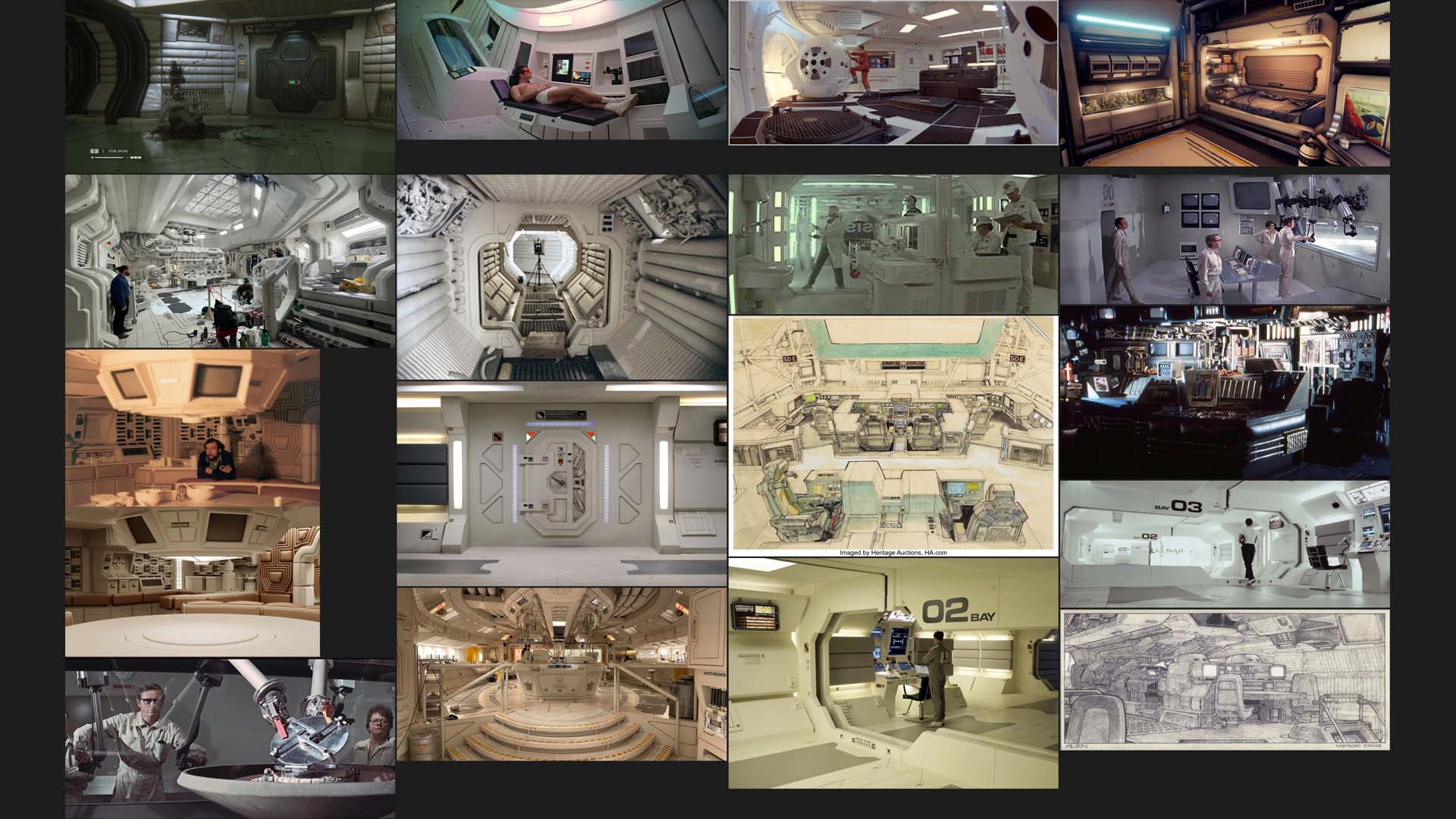
The Captain's Table project begins with solid groundwork: gathering references and exploring inspiration. Although research continues throughout the project, it’s in this initial phase that I cement the core idea for the scene. I started by gathering reference images and screenshots from films and film sets that epitomize the retro-futuristic aesthetic, including Alien, 2001: A Space Odyssey, Moon (2009), Outland, and The Andromeda Strain. These movies offer a treasure trove of inspiration, each with its own unique take on the style.
One of the reasons Alien and 2001 resonate so much is their authenticity. They’re not modern attempts to replicate retro-futurism—they were created in an era where their vision of the future was genuinely forward-thinking. In that sense, they offer a more organic perspective on what someone living in the 1970s might have imagined the future to look like. This authenticity brings a level of believability and charm that’s hard to replicate.
That said, some modern films have done an exceptional job of capturing this aesthetic as well. Films like Moon and even The Mandalorian incorporate retro-futuristic elements seamlessly, proving that the style is still relevant and impactful when done right. These references helped shape not only the visual style of my scene but also the subtle narrative elements, like the eerie atmosphere and functional design choices.
This phase has been invaluable in ensuring the design of my scene feels consistent and grounded. From textured surfaces to old-school CRT monitors and tactile mechanical controls, every detail is informed by this rich library of visual inspiration.
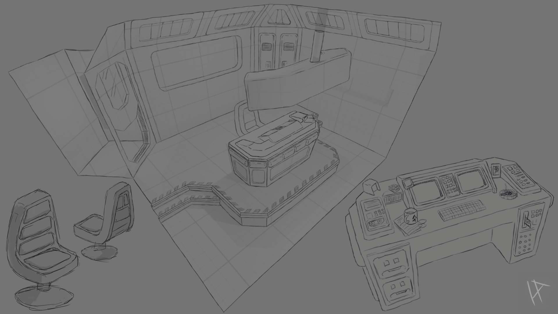
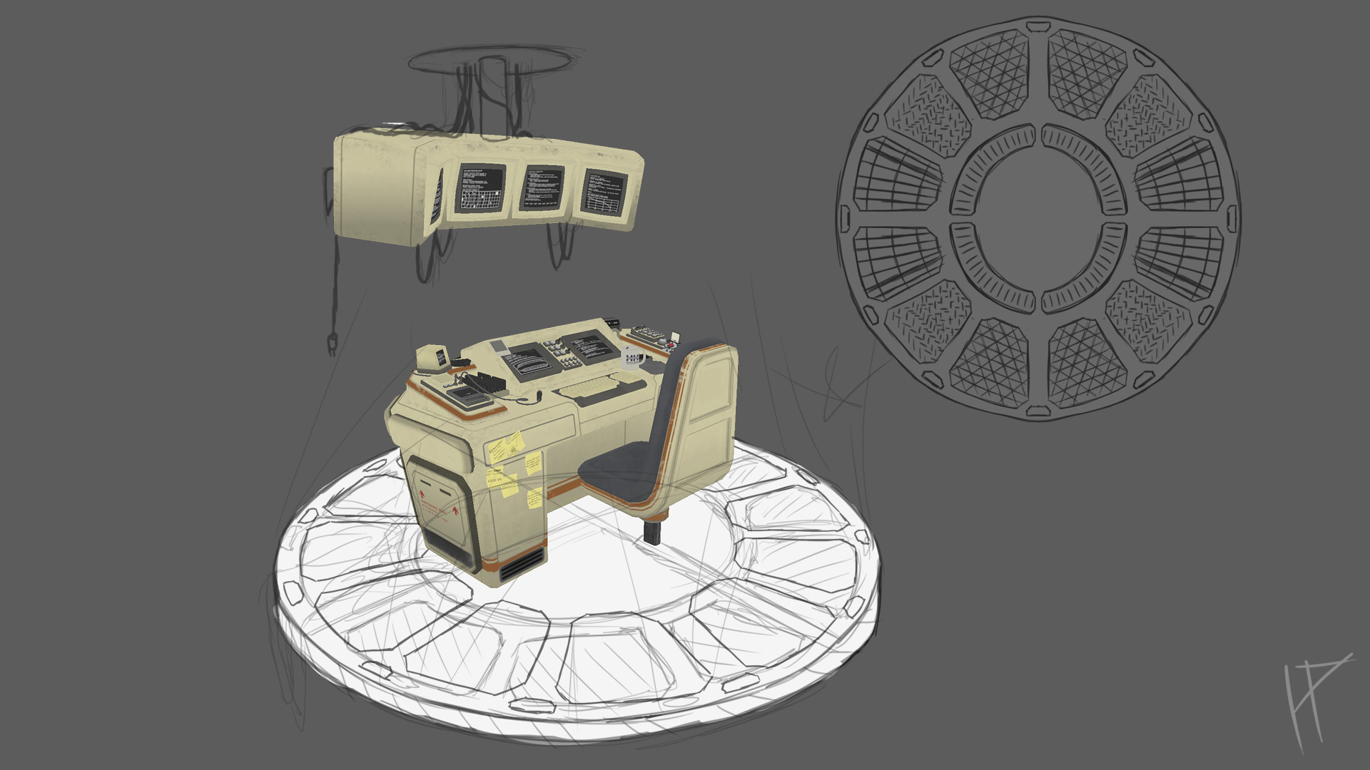
The concept art phase for The Captain's Table wasn’t about creating a polished, gallery-ready piece but rather a functional tool to help me quickly visualize the space. I constantly jumped between 2D and 3D, a workflow that allowed me to explore the scene’s composition and scale without committing too early. Starting with rough sketches, I laid out the general structure of the desk, chair, and monitors, keeping the design simple yet purposeful.
By moving into Maya early on, I could block out the rough dimensions and proportions. This 3D pass gave me a tangible sense of the space, letting me quickly see what worked and what didn’t. From there, I’d take a screenshot, sketch over it in Photoshop, and refine the design further. This back-and-forth workflow was invaluable for testing ideas, adjusting the layout, and ensuring the scene felt balanced and believable.
Rather than locking down every detail, the goal was to establish a foundation that left room for flexibility. The desk’s layout, for example, was adjusted multiple times as I considered how the captain might interact with it—adding elements like the built-in monitors and subtly angling them for ergonomic realism. This iterative process allowed me to refine the scene’s visual language without getting bogged down in unnecessary detail.
One key challenge was designing a space that felt both functional and lived-in. To achieve this, I added rough placeholders for props like coffee mugs, tools, and personal items, which I planned to flesh out later. These quick concept passes gave me a clear roadmap for the next stages while keeping the creative process fluid and efficient.
Initial Blockout

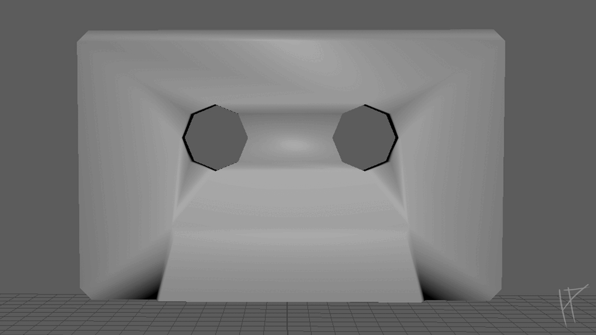
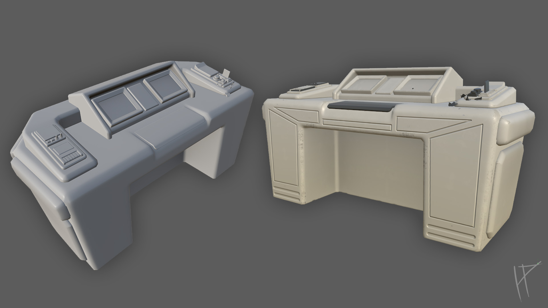
The blockout phase was where the scene began to take shape. As it coincided with the concept art stage, the back-and-forth workflow between 2D sketches and 3D blocking allowed me to refine the overall composition efficiently. The purpose of the blockout was to establish a solid sense of scale, proportion, and layout before diving into detailed modelling. This step is crucial, forming the foundation of the entire project and ensuring that everything feels cohesive and believable once fully realised.
To gain a better perspective of the scene, I imported the blockout into Unreal Engine and used the first-person template to walk through it. Viewing the space at a human scale helped me understand how the captain might interact with the environment. This was especially important for assessing the desk height, chair positioning, and monitor angles, ensuring they felt natural and functional.
The blockout itself was created using basic geometry. These shapes were enough to represent the necessary elements. At this stage, I wasn’t focused on topology or fine details; the aim was speed and clarity. I experimented with different layouts, tweaking the positions of key elements like the desk, chair, and overhead monitors to achieve a balanced composition. Viewing these changes in real-time through Unreal added an immersive layer that made spotting and correcting any awkward proportions much easier.
Although it might be tempting to skip ahead to detailed modelling, taking the time to nail down the blockout ensures the rest of the project flows smoothly. It is far easier to adjust shapes and scale early on than to realise later that something feels off and have to rework it. By the end of the blockout phase, I had a clear framework for the scene, ready to transition confidently into the next stage.
Modeling
Modeling Details
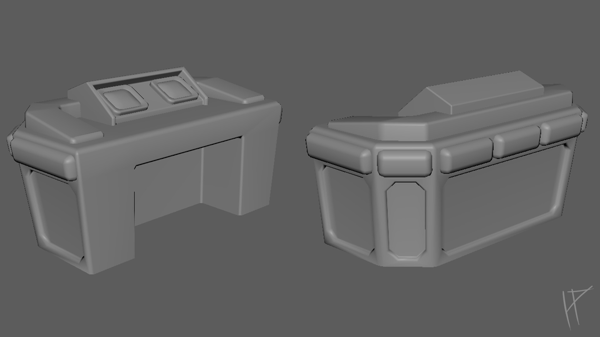
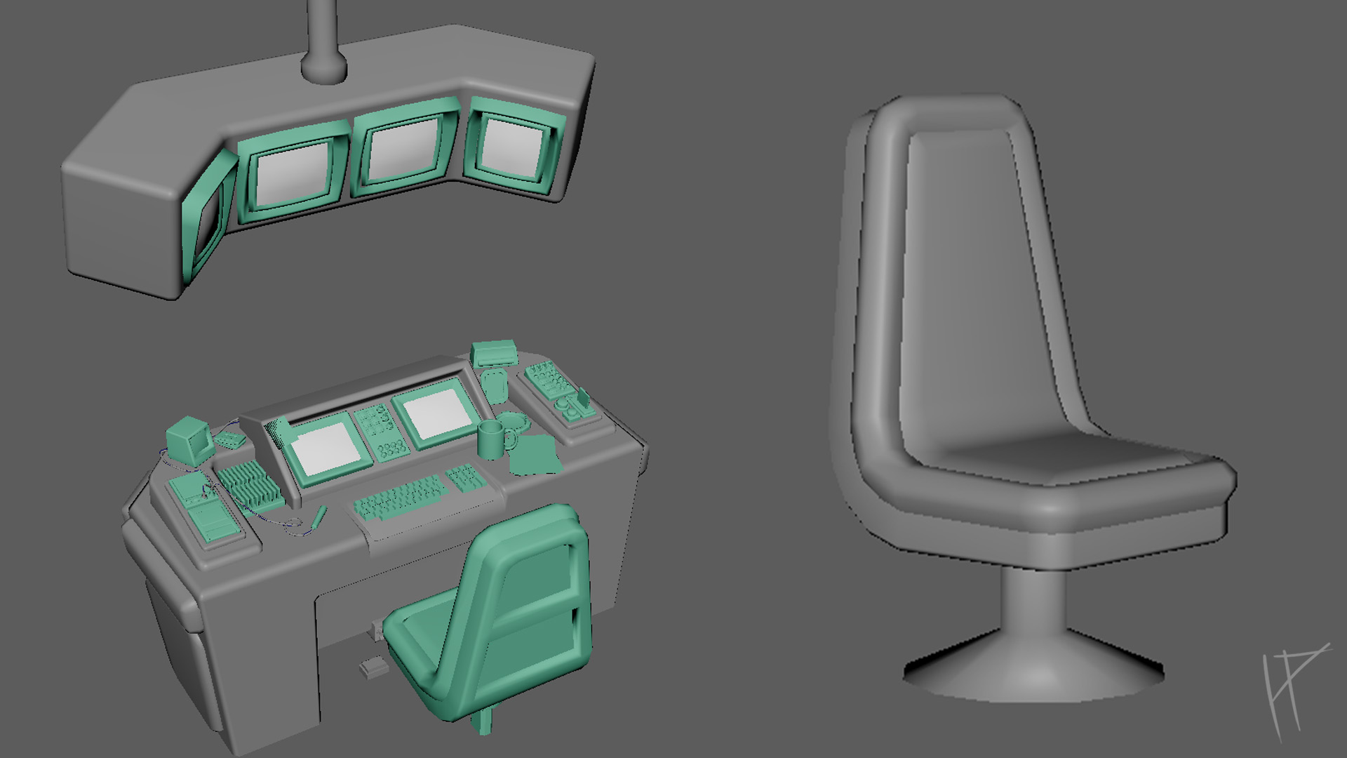
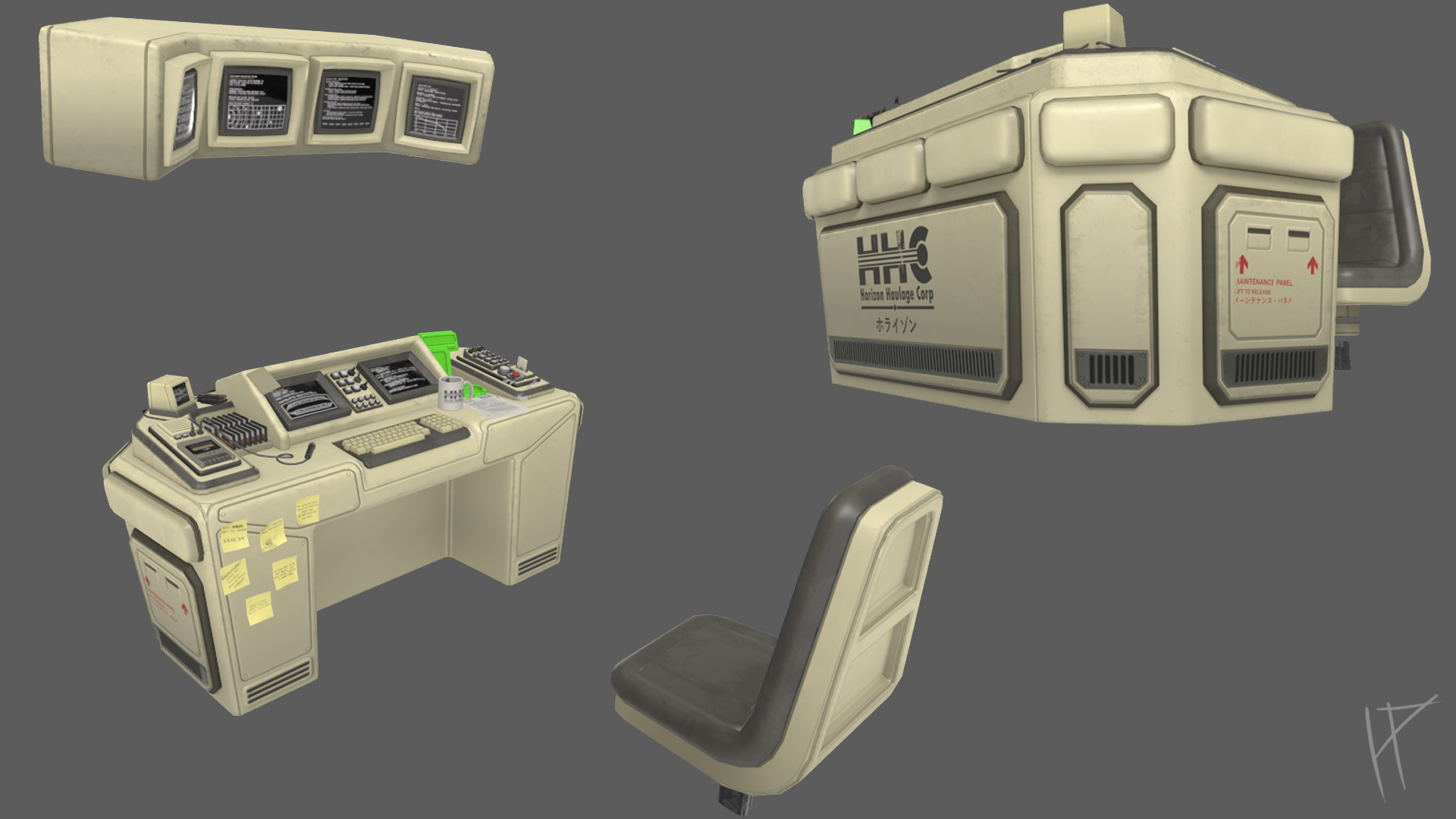
Once I had a solid blockout and received some feedback, I refined the design and began modelling the desk. I made the decision to leave the environment aside until the captain’s table itself was in a solid position. While the surrounding environment is important, the focus of the project is the captain’s table, so prioritising it made sense. This way, the environment could act as a stretch goal, rather than overloading myself with unnecessary tasks. It might not be the most ambitious way to plan a project, but it felt like the most sensible.
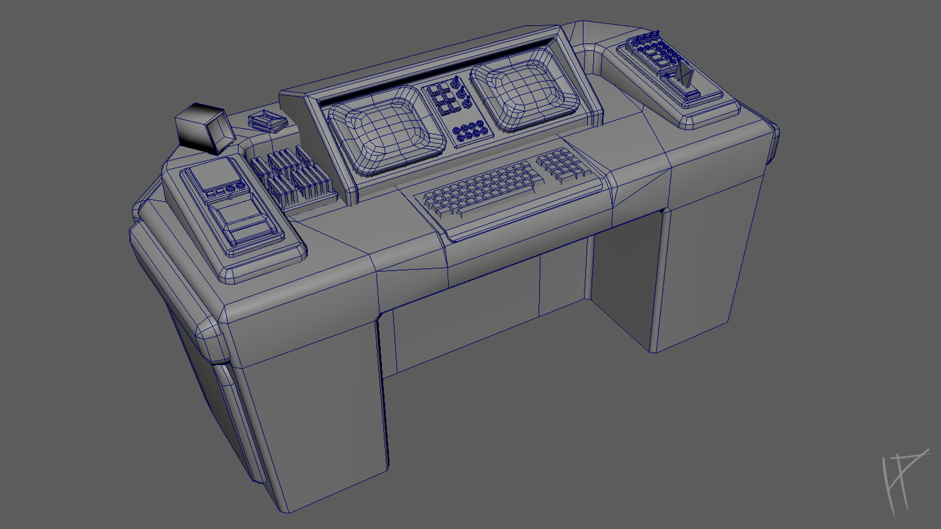
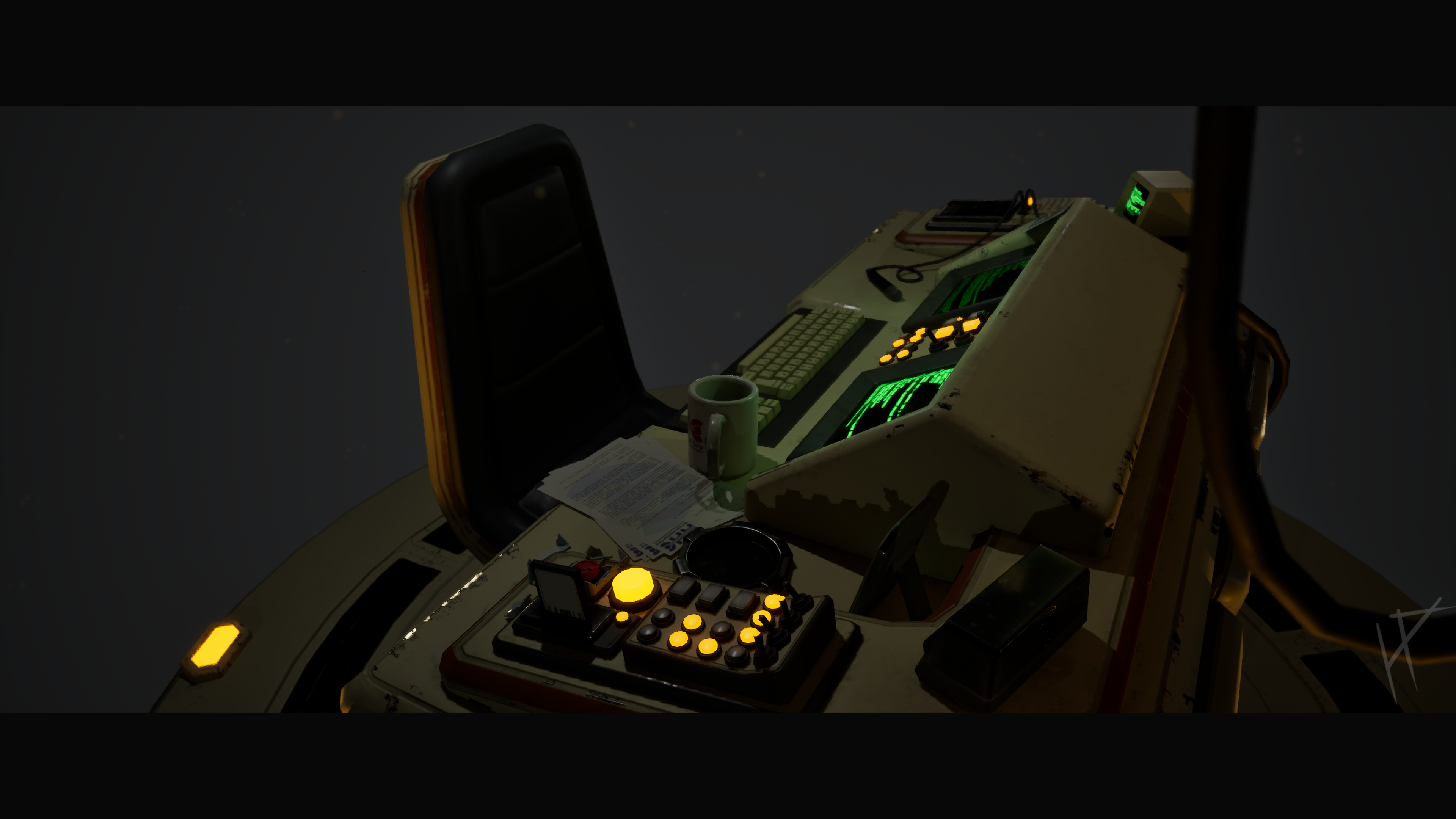
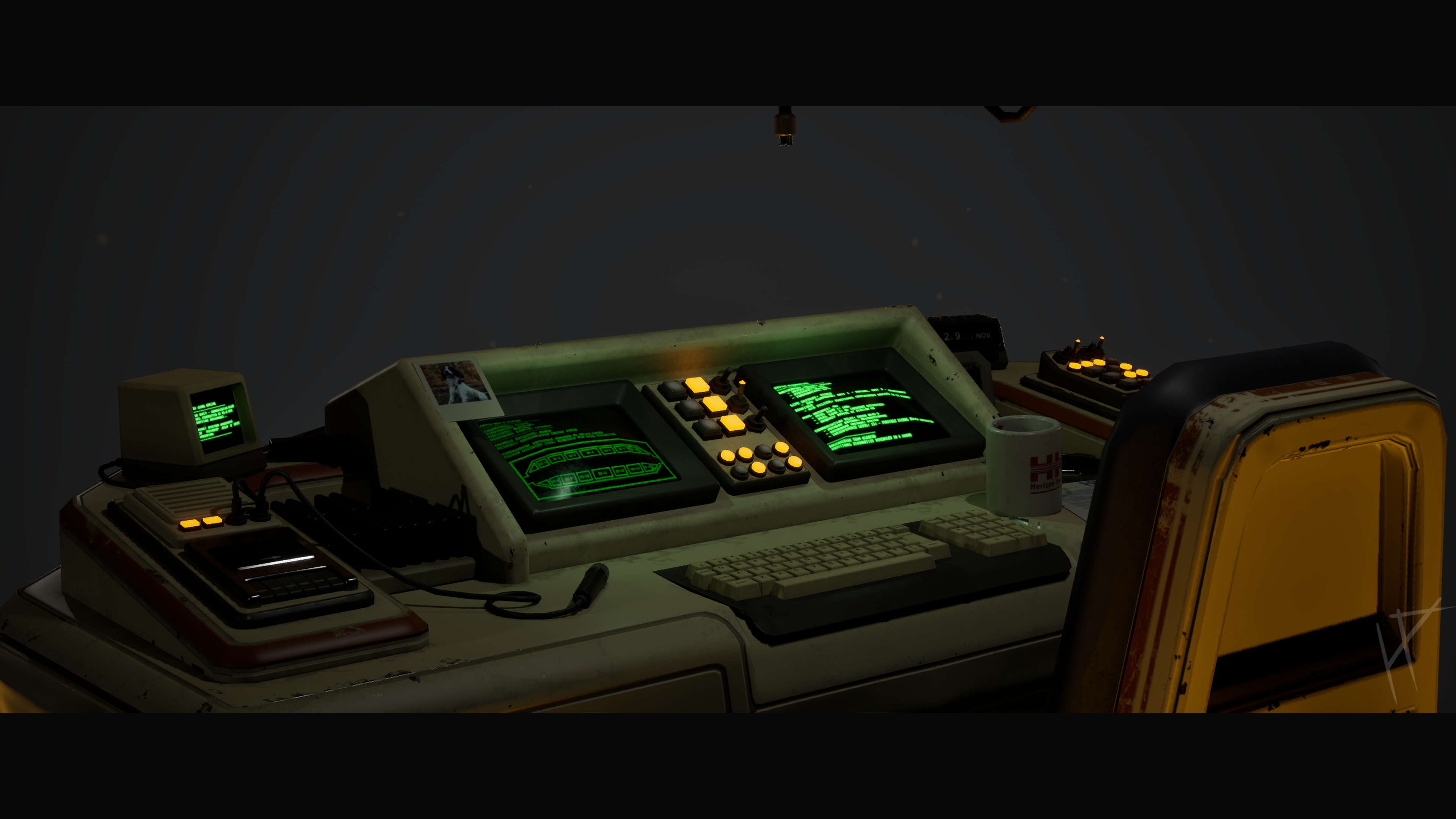
I began gradually adding detail and refining the topology of the desk. Standard modelling stuff at first—blocking out larger shapes, ensuring the proportions worked, and then moving into finer details. As I worked, I kept making small tweaks to the design based on feedback and my own observations. One feature I added during this phase was the extruded panels, these where mainly just to break up the design and hide symmetry, but also acted as in-world maintenance access.
Not everything went smoothly, though. One problem I encountered was balancing the desk’s proportions with the surrounding space. At one point, the desk felt too imposing, dwarfing the chair and making the workspace look cramped. To solve this, I used Maya’s measurement tools and imported a first-person camera rig to view the scene from a human perspective. This helped me adjust the scale more accurately and ensure the desk felt imposing but not overwhelming. With each iteration, the desk became more refined and detailed. It was rewarding to see it evolve from a rough blockout to something that felt tactile and believable, like an actual workspace someone could sit at for hours. Gradually, I started to see the captain’s personality emerging through the design, which motivated me to keep pushing forward.
Normals issues
A consistent issue I faced while modeling was the normals of my mesh. Due to optimising the topology, I encountered shading problems where faces that were meant to appear flat ended up with subtle but ugly creases. This was an issue I had also touched on in my light rig project, but it became even more prominent here. Flat surfaces, particularly on the desk, would distort in a way that detracted from the overall look of the model. The solution came in the form of a plugin I discovered, which essentially fixed what Maya should already do but often doesn’t. With the click of a button, it recalibrated the normals across the mesh, smoothing out inconsistencies without requiring me to manually adjust every point. This plugin saved me hours of frustration and allowed me to focus on refining the design instead of battling technical hiccups. It was satisfying to see those creases vanish instantly, leaving behind clean, sharp surfaces that aligned with the retro-futuristic aesthetic I was aiming for.

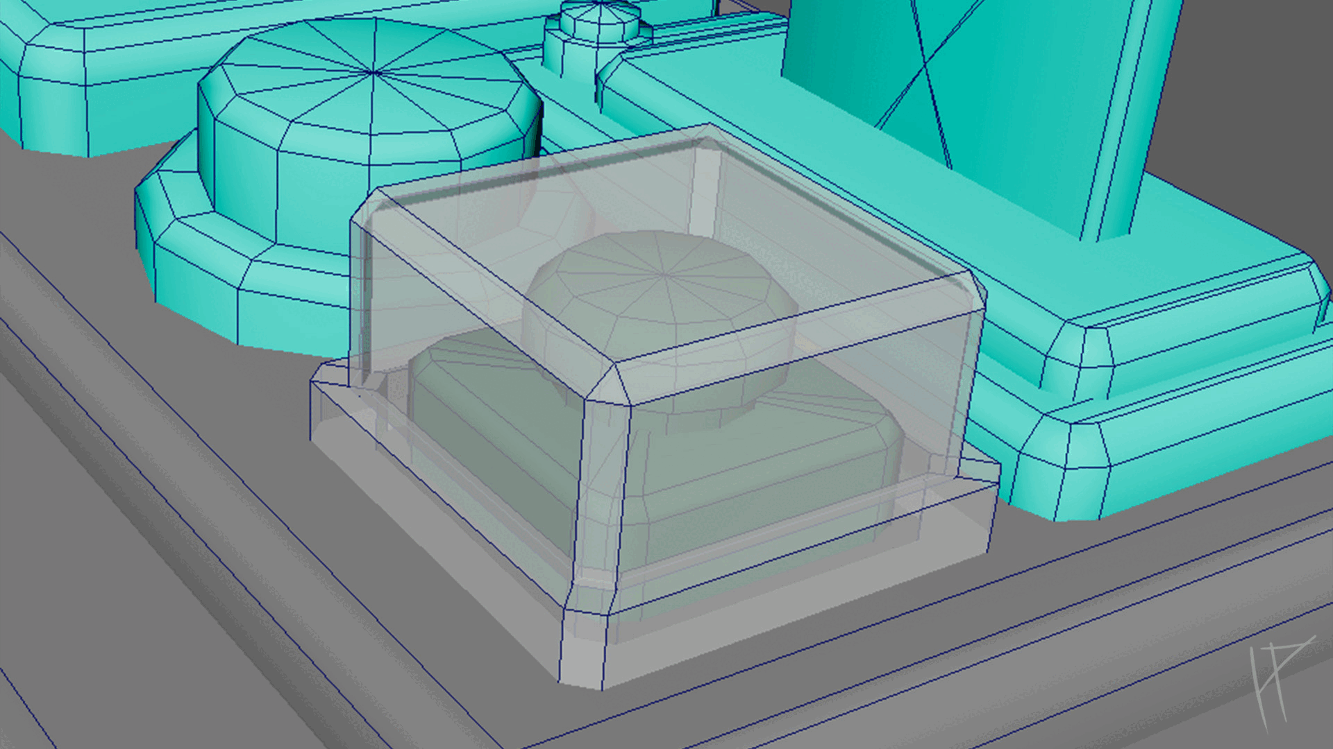
Creating broken glass
When it came to creating the little emergency break glass button, I decided to experiment with Maya’s Mash toolset. It worked well initially, calculating a way to break up the mesh into smaller pieces and giving me the look of shattered glass. However, the results came at a price—Mash produced an unoptimised, high-poly mesh that wasn’t practical for my project. In the end, I abandoned Mash and opted for a simpler approach using Maya’s knife tool. This allowed me to cut the mesh manually, defining the exact shapes I wanted. From there, I separated the pieces along the lines I had created, extruded them slightly, and voilà—a shattered glass mesh that was far quicker to create and much better optimised. Mash certainly has its uses, but for a small, one-off asset like this, manual work was the clear winner. Plus, it was oddly satisfying to watch my carefully placed cuts come together into a final piece that felt deliberate and efficient.
Texturing
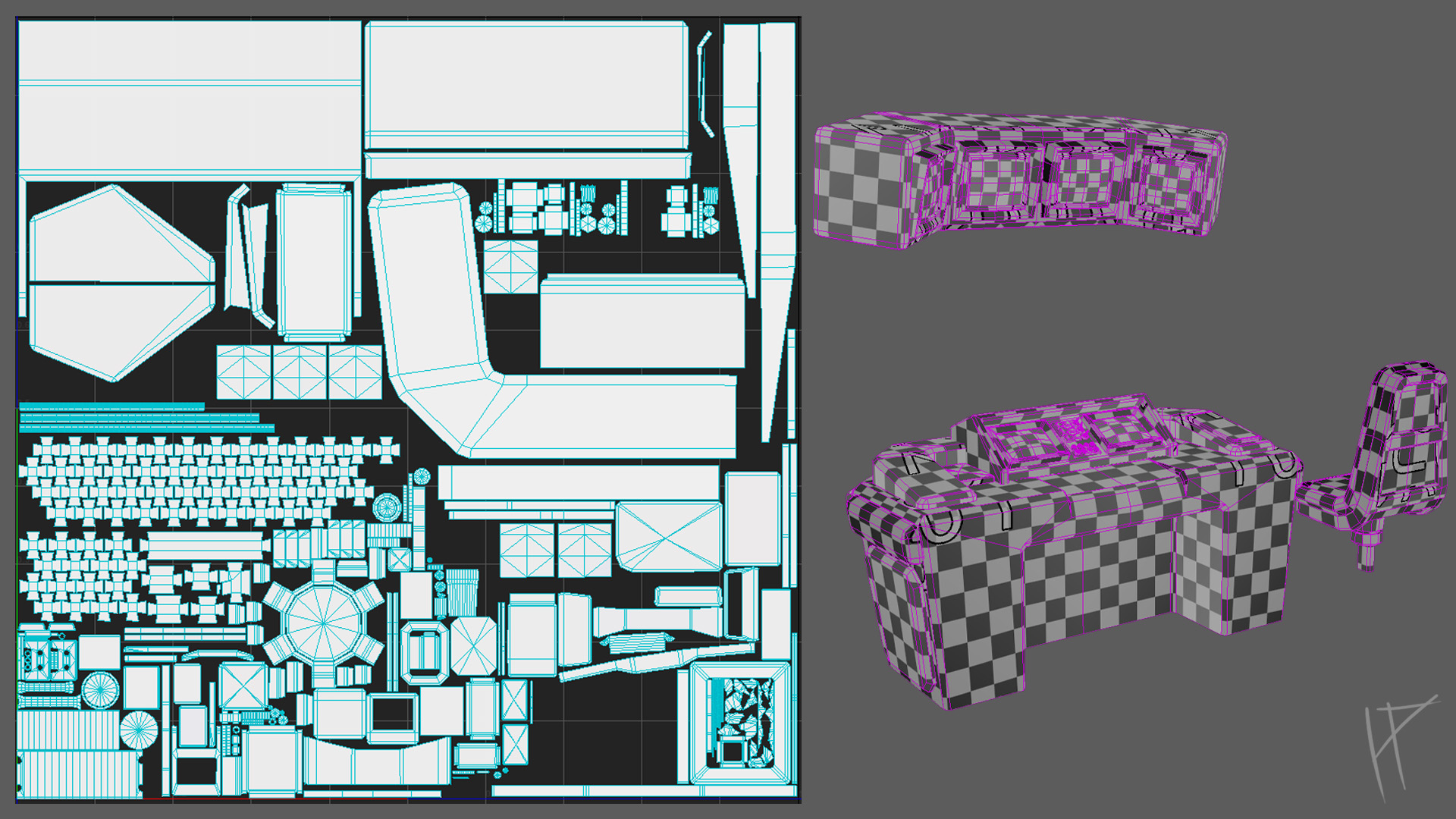
Once I finished the main modeling, I moved on to texturing. But before I could start, I had to unwrap my model, which, let’s face it, is not exactly anyone’s idea of fun. Looking back, my unwrapping method could have been much better. The props were fine, but the desk, being the centerpiece and a large object in the scene, took up a ridiculous amount of UV space. I had to rely on symmetry just to fit it onto a 2K texture sheet, and even then, I needed multiple texture sheets to make it work.
I was aware of trim sheets and had planned to use them for the surrounding environment, but when it came to the desk, I was worried about losing quality and not being able to include the unique details I wanted. In hindsight, this was probably not true, since I could have added those details with decals on top of the trim sheet. Lesson learned for next time.
Eventually, I got the entire desk and all the props unwrapped at the correct texel density and spread across a few UV sheets. I did have to make exceptions for a couple of props, like the paper documents and the screens. These had text on them, and at the correct texel density, the text would have been too blurry to read. Sometimes you just have to bend the rules for the sake of clarity.
With my main desk and props unwrapped, I brought everything into Substance Painter. As with my light rig project, I had been creating "high poly" versions of my assets as I went along. For this, I simply added supporting edges and loops, then applied a smooth modifier. This approach gave me something to bake with when it was time for texturing, which saved me some effort down the line.
By this point, my scene was packed with props and small details, so I gave everything a bright green base colour. It might sound odd, but I picked green because I knew it was a colour I wouldn’t be using much, if at all, in the final scene. This made it easy to spot which assets I had textured and which ones were still waiting for attention. It turned out to be a surprisingly handy trick.
I started by creating a basic white plastic material to use as a foundation. I gathered plenty of references for this, mostly from the films I had mentioned during my research. Once I had the material nailed down, using a combination of simple fill layers and masks, I converted it into a smart material. This made it easy to apply across the project, keeping everything consistent and saving me a lot of time.
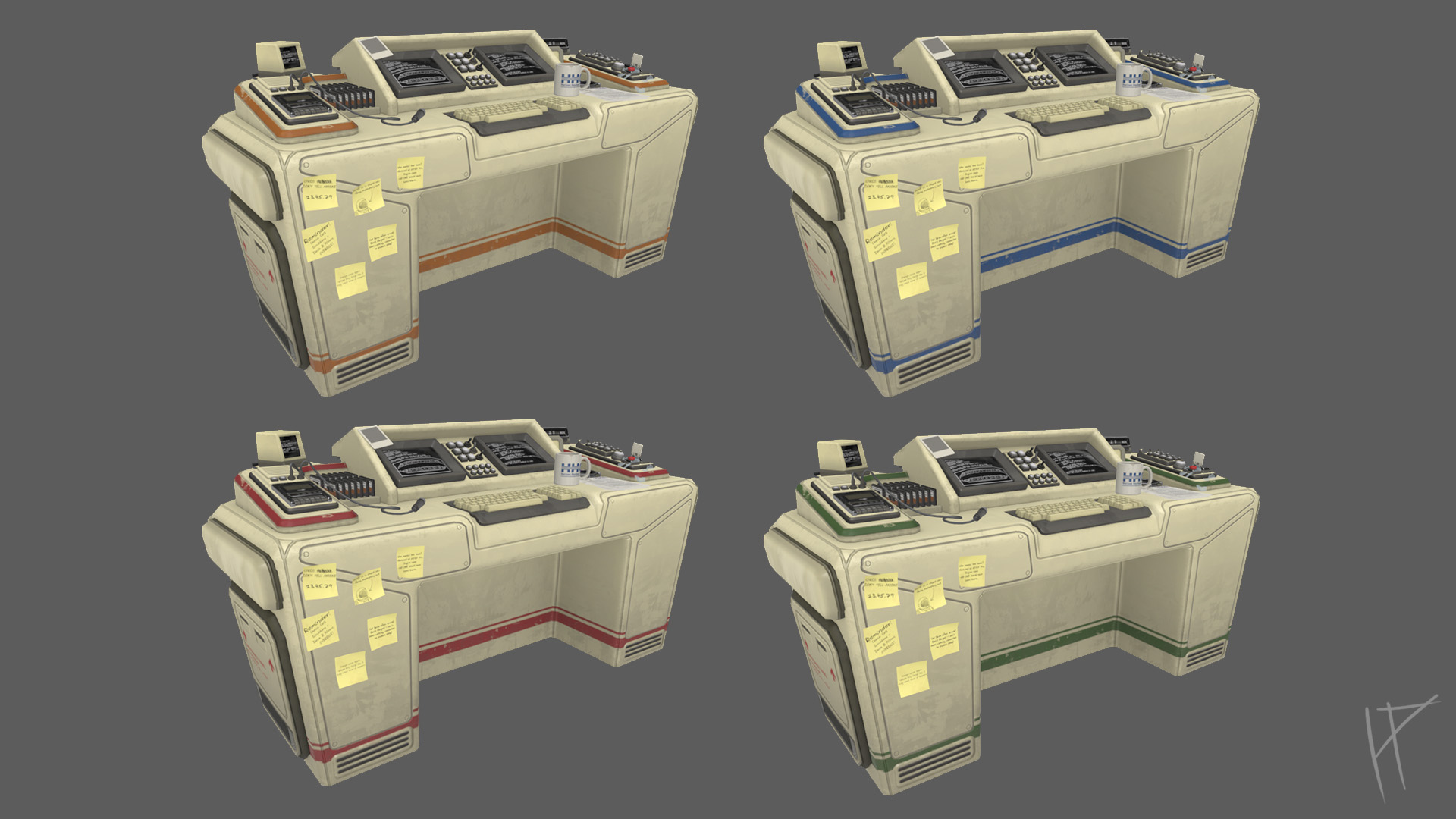
I gradually began texturing the rest os the assets, focusing on developing a cohesive style that would tie the scene together. One of my first steps was creating master materials, like the white plastic. By adjusting a few values, I could use this base material to create entirely new ones, like rubber or painted metal, while keeping a consistent visual style. This approach saved time and made everything feel like it belonged in the same world.
I planned to incorporate decals into the scene to enhance realism and flexibility. My thought process was simple: anything you could clean or wipe away in real life, like coffee stains, boot marks, or scuffs on the underside of the desk, would be better as a decal rather than baked into the texture. There were a couple of reasons for this. First, decals would allow for more reusability of assets. If the desk or other props were used multiple times in different areas, having options for different levels of dirt or damage would make them feel unique and believable. A desk in perfect condition might work in one area, but in another part of the scene, a few coffee stains or scuffs would tell a story about the person using it.
The second reason was more technical. Since I had mirrored the UVs on the desk to optimise texture space, baking dirt or damage into the texture would immediately give away the symmetry, breaking the realism of the scene. Using decals would allow me to add these details dynamically without being limited by the mirrored UVs.
Even though I didn’t get as far as implementing decals in this project, thinking about their potential use influenced how I approached the textures. I made sure to leave room for those dynamic elements and designed my materials with the flexibility to adapt to them in the future.
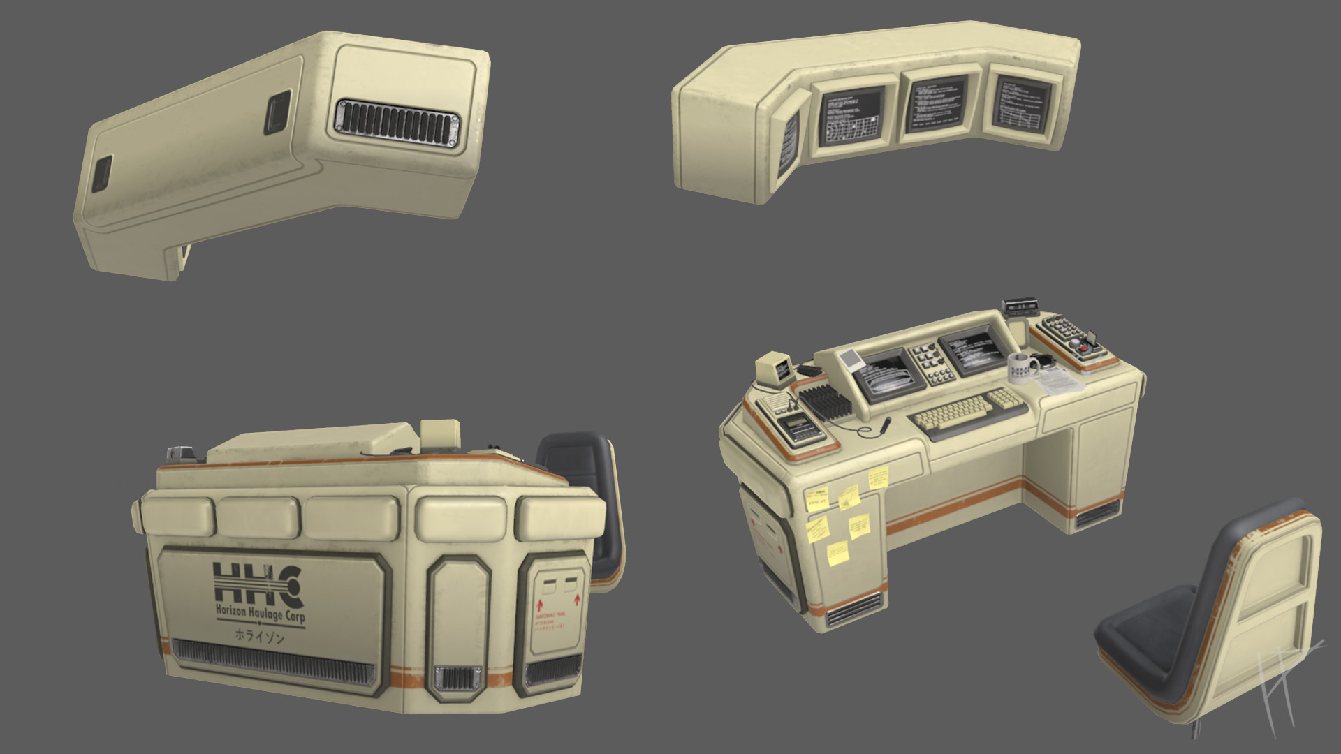
During the texturing process, I also worked on creating focal points to guide the viewer’s eye. For instance, I adjusted the saturation on logos or text to make them stand out, while leaving other areas more muted to avoid visual clutter. These subtle tweaks helped bring the scene to life and added an extra layer of polish.
One challenge I encountered was making the materials feel grounded and believable, especially when working with large, prominent objects like the desk. At one point, I realised the surfaces felt too pristine and lacked the natural imperfections that give objects character. To address this, I added an extra layer of damage, adding a metal material, then masking it off, making it very subtle, i also used gradients and darkened some areas to add visual interest and help break the materials up a bit.
Looking back, while I didn’t get to explore everything I wanted, like decals, I feel the project benefited from the planning I put into those ideas. It’s something I’ll definitely carry forward into future work. The process taught me that even small, incremental improvements can add up to a big impact when creating a cohesive, believable environment.
Vignette creation
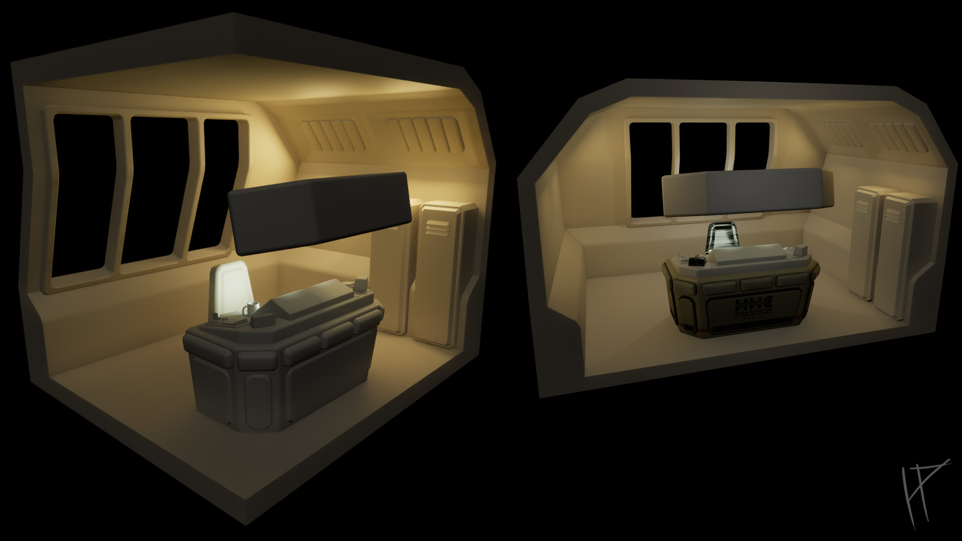
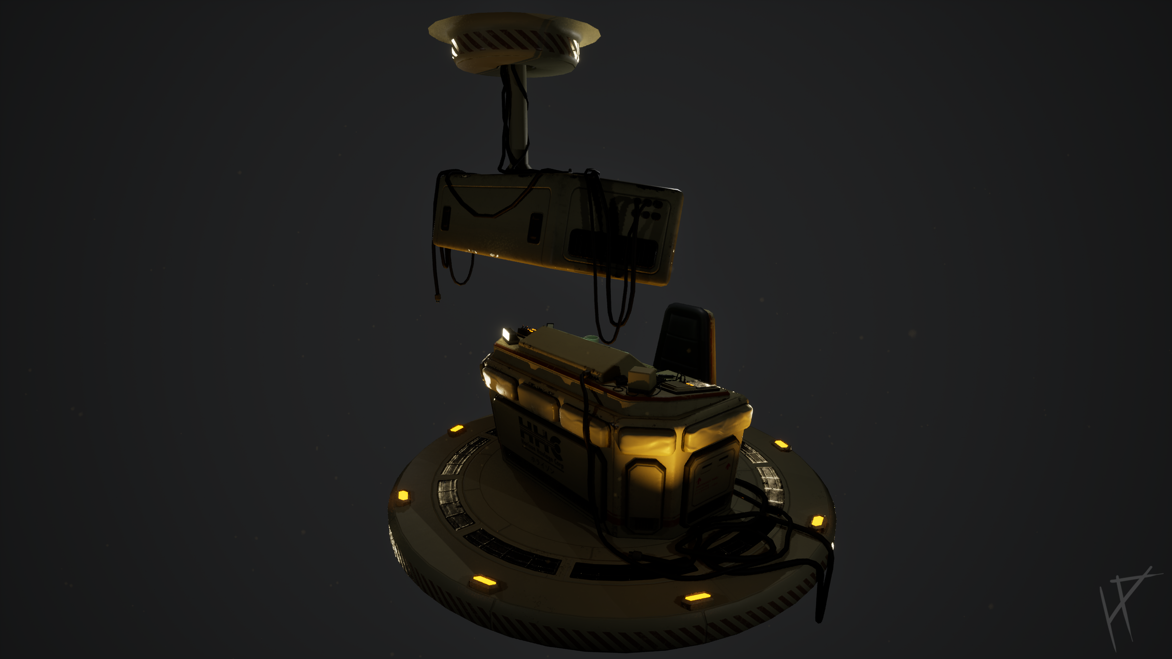
At the start of this project, my plan was to create a small environment, as shown in the initial blockout above. However, as I started working on the Captain’s Table, I realised there was a lot more I could refine and improve on with the table itself. Rather than dividing my time between the table and a bunch of supporting assets, I decided to scale the project down to a vignette and focus entirely on the main feature. To be honest, I ended up liking this approach a lot more—it allowed me to hone in on the details and really bring the Captain’s Table to life.
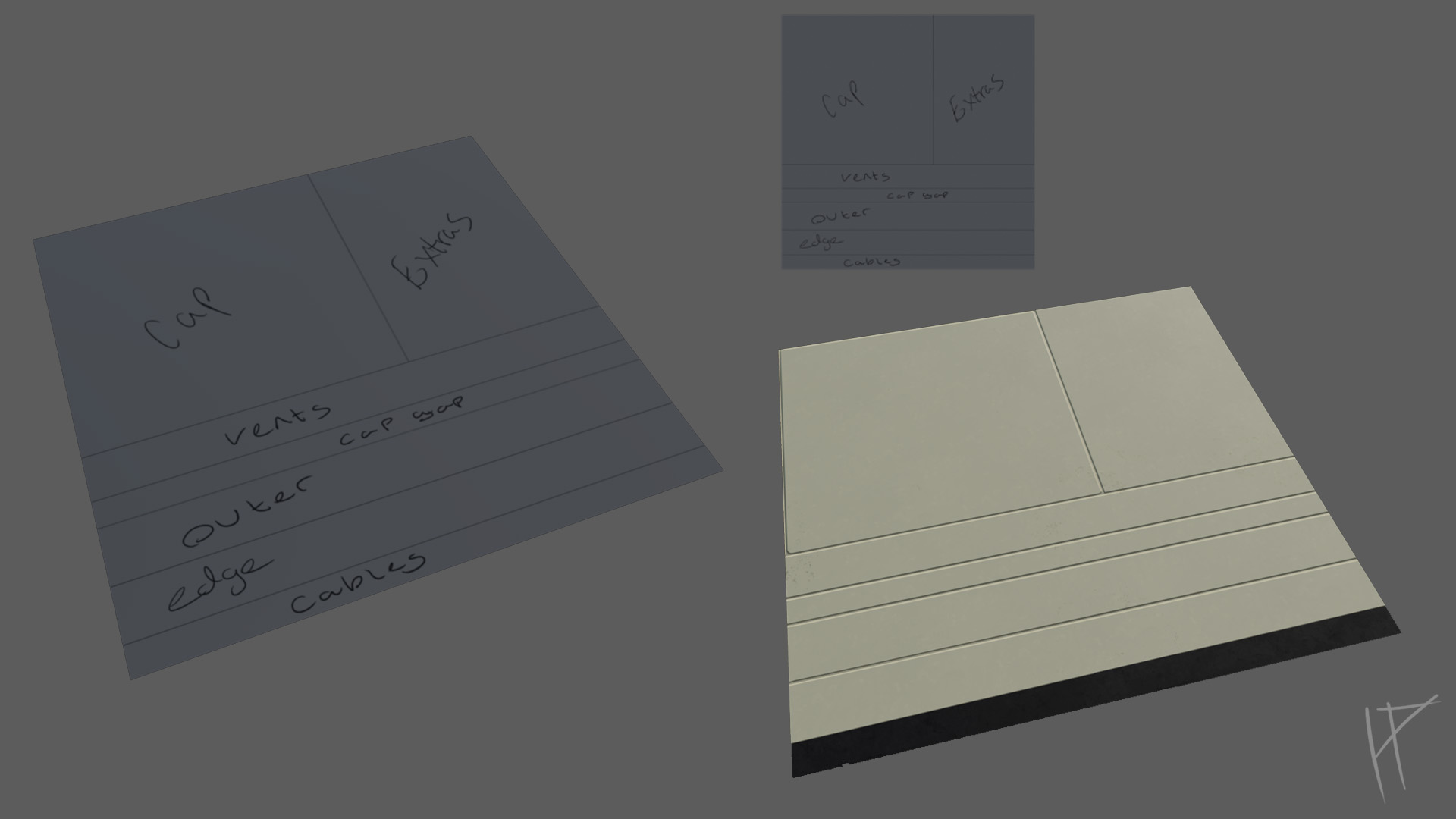
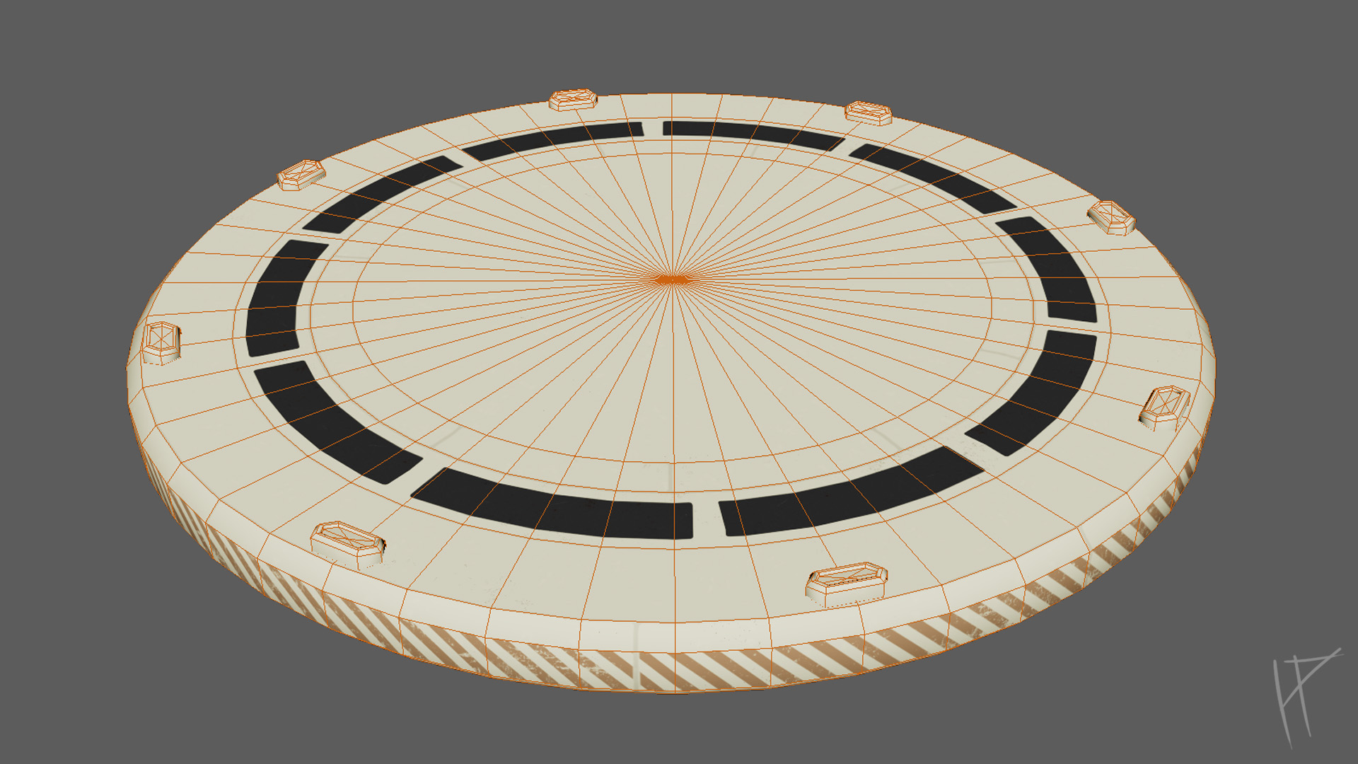
For the vignette, I knew I wanted to use a trim sheet. At first, I was hesitant, since I’d only used trim sheets once before during my first year, and I remembered not liking them much at the time. But after watching a few tutorials online, I decided to give it another shot. I started by breaking down my concept art to see how I could approach the trim sheet design. The circular floor presented a challenge because the textures were bound to get warped unless I used a ridiculously high-res mesh. I decided I could live with a bit of warping and pushed forward.
To plan the trim sheet, I began in Photoshop, breaking it down into sections and labeling each part for clarity. Once I had a solid plan, I brought the design into Maya and applied it to my mesh. This let me unwrap the mesh and test how well it worked with the trim. After a few adjustments, everything started coming together. I gradually updated the trim sheet in Substance Painter, working on a flat plane, and any time I wanted to see how it looked on the mesh, I exported the textures. Maya automatically updated the materials, so for once, Maya proved itself useful!
The trim sheet process turned out to be much faster than I expected, though I did keep the design relatively simple to make it more versatile. This simplicity paid off—I was even able to reuse the trim sheet to add an extra part at the top of the scene to hold the monitors. It was at this point I realised how much more I could have utilised trim sheets throughout the project. They not only cut down on texture space but also reduced the number of materials and draw calls in Unreal Engine, which is always a win for optimisation.
Overall, the vignette and trim sheet turned out great, though there’s still plenty of room for improvement. For example, I could have optimised the space on the texture sheet better and added more variation to make the trim sheet even more versatile. Despite these areas for growth, this experience showed me just how powerful trim sheets can be and left me feeling much more confident about using them in future projects.
Conclusion
The Captain’s Table project began with the goal of creating a retro-futuristic scene that felt immersive and believable, blending stylized design elements with a grounded aesthetic. My focus was on honing my modeling, texturing, and scene composition skills, while pushing the boundaries of what I’ve done in previous projects. The result is a vignette that highlights the Captain’s Table as the centerpiece of the scene, drawing inspiration from iconic films like Alien and 2001: A Space Odyssey.
Throughout the process, I encountered several challenges that tested my adaptability. One of the biggest hurdles was optimizing the UV layout for the desk. Its large size and mirrored UVs created limitations for texture detail, but I used careful planning and adjustments to balance texel density across the asset while maintaining quality. Another challenge was creating materials that felt dynamic and believable. Early iterations lacked depth, particularly with emissive and reflective surfaces. After receiving formative feedback, I focused on adding roughness adjustments, subtle color variations, and more saturation to key details like logos and text. These changes brought a new level of vibrancy and realism to the scene. Additionally, I explored how lighting and post-processing in Unreal Engine could enhance the atmosphere, using emissive and reflective elements to create a retro-futuristic aesthetic that highlighted the key details of the Captain’s Table.
One area where I stepped out of my comfort zone was creating a trim sheet for the vignette plinth. While I was initially hesitant to revisit trim sheets after not enjoying my first experience with them, this time I approached it with more confidence. By planning the trim sheet in Photoshop and testing it with simple flat planes in Substance Painter, I managed to optimize texture space and reduce the number of materials needed for the plinth. This process also highlighted how much more I could have utilized trim sheets throughout the project to cut down on materials and draw calls in Unreal Engine, especially for repetitive elements.
This project taught me the value of pre-planning and iteration. I also learned the importance of subtle storytelling details, like incorporating wear and tear on props, to make the environment feel lived-in and authentic. For instance, adding scuffs, smudges, and post-it notes with slight discoloration helped the scene feel more grounded. While I didn’t use decals this time, incorporating them in future projects could give me more flexibility in adding dynamic details without being limited by UV layouts.
Looking back, there are areas I would approach differently if given the chance. For example, I could have allocated more time to the supporting environment, as adding a few extra elements would have enhanced the overall composition and made the vignette feel more complete. Additionally, optimizing the trim sheet layout further or adding more variation to its texture would have increased its versatility.
Despite the challenges, the Captain’s Table project was an incredibly rewarding experience. It pushed me to refine my workflows, embrace new techniques, and stay open to feedback throughout the process. The final result feels like a significant step forward in my development as an artist, showcasing my ability to create realistic and stylized assets while maintaining a cohesive atmosphere. While there’s always room for growth, this project has left me feeling more confident and excited to tackle future challenges.

Captain's Table on ArtStation
Click the image to view the full project on ArtStation.