Cloud Imperium - Mobile Light Rig
Planning
This is my first project of the third year at DMU, a professional brief provided by Cloud Imperium Games. The task is to create a mobile lighting rig based on concept art they have supplied, approaching it as if it were part of a AAA game production. The project requires strict adherence to a set tri-count and texture budget, ensuring the asset is both optimised and visually impressive.
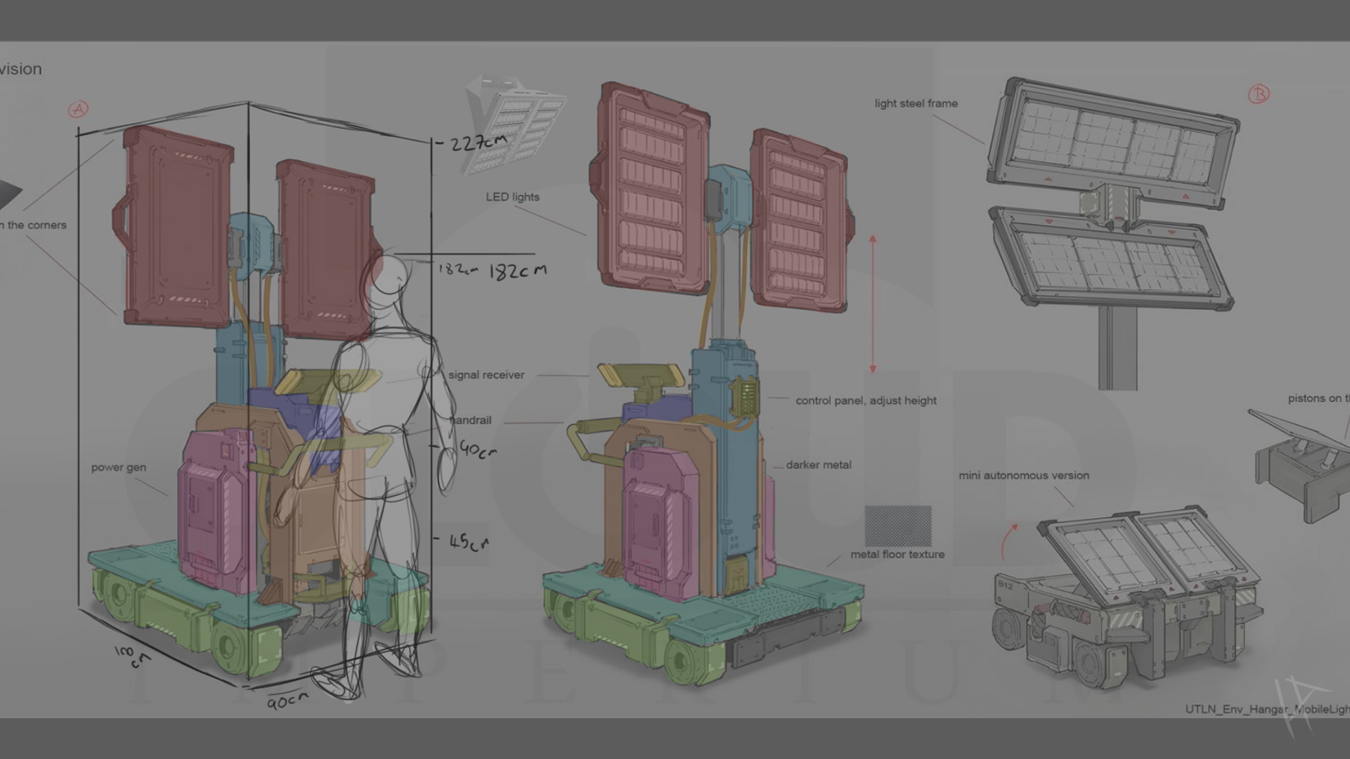
I started by bringing the concept art into Photoshop. My first task was to analyze the prop and come up with a plan for how to approach the modeling process. Right away, I noticed that the design was mostly symmetrical, which made things a bit easier. But when I looked at it as a whole, the different components felt a bit disjointed. To help clarify things, I painted over the image with transparent layers, identifying and separating the different sections. This would come in handy later when it was time to model each part.
Next, I needed to figure out the scale of the asset. The concept art didn’t provide any clear indication—usually, a human silhouette is included to give a sense of scale, but in this case, there was none. So, I focused on the handle, assuming it would be roughly the size of a typical trolley handle. Using that as my reference point, I sketched a 6-foot-tall human figure to keep things simple. From there, I was able to estimate the size of the prop accurately, which allowed me to begin the 3D modeling process.
Modeling
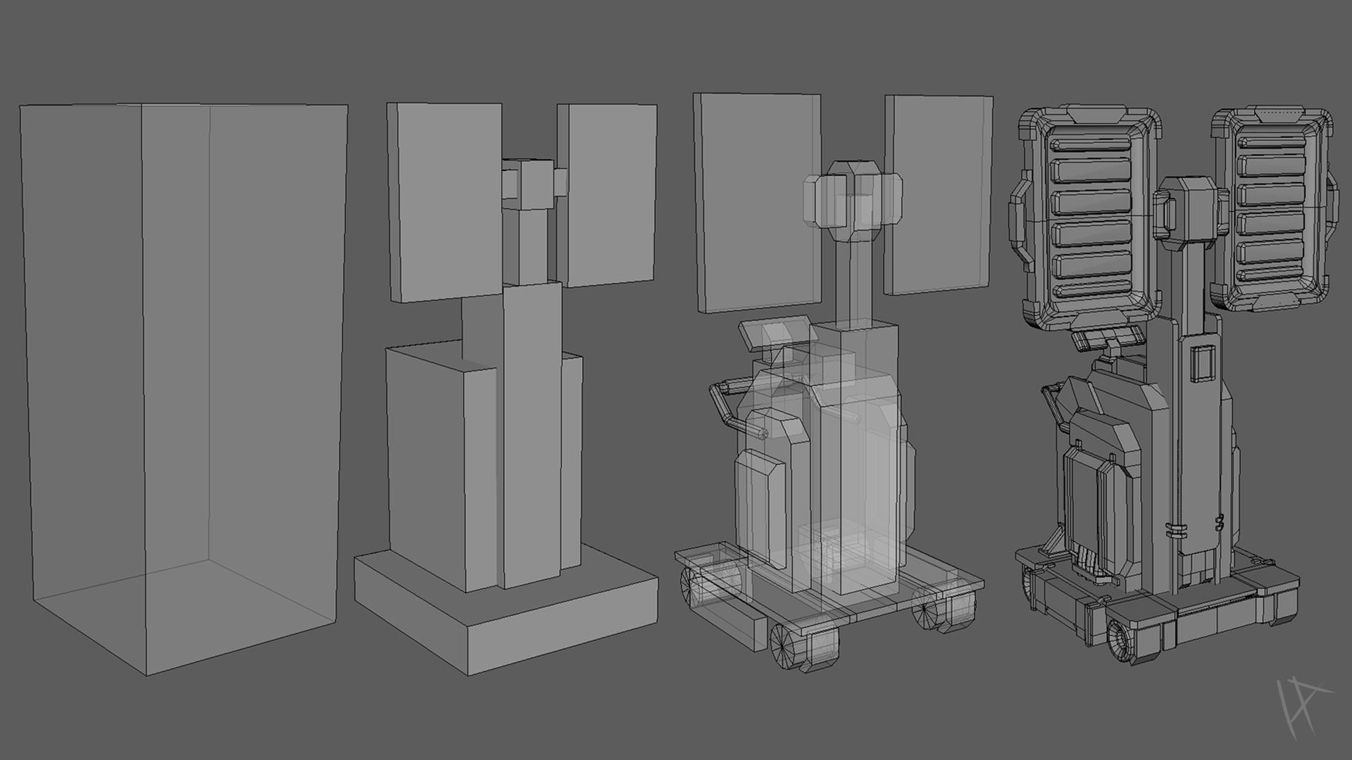
I began the modeling process by blocking out the light rig, starting with a basic cube that I scaled to the dimensions I’d established from analyzing the concept art. To keep things consistent, I set up my units in Maya to centimeters—nothing ruins a good import like discovering your model is now the size of a city in Unreal. At this stage, I focused on getting the basic structure in place, concentrating on the major forms and keeping the blockout as simple as possible.
With the first blockout in hand, I moved on to a second pass, adding a bit more refinement. This time, I referred to my color-coded paintover of the concept art, breaking down the model into sections. Since I was still in the early stages, I wasn’t too concerned about ngons or perfect topology—just getting everything blocked in was the priority. I was aiming for a sturdy foundation, something to build upon in the next stages.
For the final iteration of the blockout, I ended up adding more detail than I originally planned. While it’s easy to get carried away at this point, I found it useful to push the model a bit further, gradually transitioning toward the detailing phase. Even though I hadn’t yet reached the point of cleaning up topology or adding high-resolution detail, this iteration allowed me to better visualize the end result and prepared me for the upcoming, more precise stages of modeling.
General modeling process
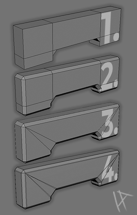
The general workflow for taking a model from blockout to the final mesh is illustrated on the left, where I’ve included screenshots of a small segment of my model. I started by creating a simple, blocky mesh (1), which roughly matched the size and shape I needed. At this stage, precision wasn’t the goal—I just focused on capturing the basic proportions and forms to ensure the mesh would align with the concept art.
With the initial blockout in place, I moved on to the next step: adding bevels (2). This process was primarily about softening any hard edges on the mesh, which helps to create a more natural look. In some cases, I opted for larger, more pronounced bevels, allowing them to serve as intentional design features that would stand out in the final model.
The third step (3) involved cleaning up the topology. Here, I focused on removing any ngons and optimizing the mesh by reducing the triangle count wherever possible, all while maintaining the overall form established in the previous step. This step is essential to ensure that the model remains efficient and compatible with the target tri and texture budget, especially for a AAA-style project like this.
Finally, I added supporting edges (4), which prepared the mesh for subdivision. This step was critical for reinforcing the edges and preventing any unwanted distortion when the mesh was subdivided. With these supporting edges in place, the mesh was ready to be exported as a high-poly version, which would later be used for baking details onto the low-poly mesh in the texturing phase. By following this workflow, I was able to create a mesh that was both optimized and ready for the next stages of the project.
Adding wires with the curve tool
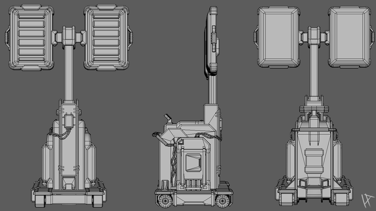
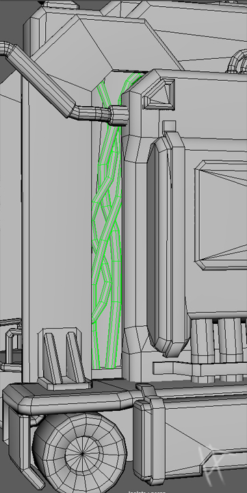
The light rig is a rigid, mechanical object, defined by its clean edges and industrial design. However, I felt it needed something to break up the hard, utilitarian aesthetic. That’s where the wires came in. While they weren’t part of the concept art, I thought they could serve as a fitting addition, adding some organic flow to an otherwise purely mechanical structure.
To create the wires, I turned to the curve tool in Maya, which proved to be both powerful and surprisingly fun to use (as long as you enjoy moving control points around for ages). I started by sketching the paths of the wires in 3D space, ensuring they had a natural flow while avoiding any awkward intersections with the rest of the model. The wires needed to feel purposeful, so I focused on the recesses where the machines internals might be visible, wires might realistically belong.
Once I was happy with the paths, I converted the curves into geometry, using Maya’s extrusion tools to give them a smooth, tubular shape. In hind sight, I could have added some more loops to the wires to create a smoother more realistic curve, but at this point, i was worried about going over the tri budget. After that, it was all about fine-tuning. The goal was to make them look intentional yet understated—functional but also visually appealing.
The wires added a small but impactful detail to the design, they introduced just enough of an organic element to make the model feel a bit more alive, like a piece of equipment that might actually exist in a world where such tools are needed. Plus, I like to think they give the light rig a little personality—like it’s got a wild side hiding beneath all that precision.
Shading Groups and Troubleshooting Normals
Once I had finished most of the modelling, I turned my attention to shading groups. Initially, most of the model worked well with Maya’s default soft edges preset. In my past work, which has leaned toward a stylized approach, I usually took the easy route of applying soft edges across the board—it worked well enough, and I got away with it. However, since this project called for a more realistic style, that approach wasn’t going to cut it.
While I had mostly bevelled edges to maintain a clean look, the level of detail in the asset meant I couldn’t afford to bevel everything without exceeding my tri-count budget. This left a few unavoidable hard edges, which caused some ugly dark areas to appear on the model. Most of these were easy to fix by applying hard edges selectively, but mixing hard and soft edges brought its own set of challenges.
The biggest issue was shading artefacts on flat planes. These faces, which should have been smooth and clean, ended up with strange shadows and distortions due to my topology and some pinching. In the past, I might have overlooked these subtle issues, hoping that textures would mask them, but this time I wasn’t willing to settle. I tried everything: editing the normals manually (which somehow made things worse), tweaking the topology (which worked but introduced dreaded N-gons), and combing through countless useless YouTube tutorials that left me no closer to a solution.
Eventually, I brought the issue to my lecturer, who explained that this was a common problem that could be easily remedied in 3DS Max. But I wasn’t about to be defeated by Maya. Determined to find a fix, I stumbled upon a plugin called AMT Normal Tools Lite during my research. This tool turned out to be a lifesaver. With just a click of a button, it fixed the broken normals and gave me the flat faces I needed. Ironically, I had already tried adjusting the normals manually without success, but somehow this tool worked flawlessly where I had failed. I wasn’t going to argue with the results, so I simply shut up and used it.
This experience was a reminder that sometimes the right tools (and a little perseverance) can save hours of frustration. The plugin not only fixed the shading issues but also helped me deliver a cleaner, more professional-looking model—without sacrificing my tri-budget or my sanity.
Unwrapping the Model
With the modelling wrapped up and shading issues sorted, I moved on to the always-fun task of unwrapping the UVs. As much as I wish this step was a quick "click and done" process, it’s all about finding the right balance—maximising texture space, keeping seams out of sight, and avoiding any stretching or distortion. Basically, a puzzle with no picture on the box.
For most of the smaller, symmetrical parts of the model, I mirrored the UVs to save texture space. It’s a super handy trick that works great for areas people aren’t likely to stare at for too long. But when it came to bigger sections, like the back of the lights and the sides of the base, I left those as unique UV islands. The reason? These areas are front and centre, and any symmetry would be glaringly obvious, taking away from the realism. I wanted the light rig to feel like it belonged in the real world, not like a perfectly mirrored video game asset.
Looking back, I realised there was a smarter way to handle this. I didn’t know much about using decals at the time, but they would have been perfect for breaking up symmetry without sacrificing texture space. By overlapping the UVs for those big pieces and using decals to add variety later, I could’ve saved a ton of space. Lesson learned for the next project.
For the actual unwrapping, I used a mix of automatic projections and manual adjustments. Cylindrical projections worked great for rounded parts like the handles, and the flat surfaces were pretty straightforward. The bevelled edges, though, gave me some grief. They needed extra care to avoid distortion and to line up nicely with connected surfaces. This part of the process was slow, but I knew it would pay off when the textures went on.
Packing the UVs was the final piece of the puzzle. Using Maya’s layout tools, I arranged the islands to use as much of the texture space as possible while keeping enough padding to prevent bleeding. A big focus during this stage was maintaining consistent texel density across the model. This was especially important for ensuring that the textures looked uniform and didn’t have any areas where the detail suddenly looked stretched or pixelated.
For the smaller, less noticeable parts of the model, I adjusted their scale slightly, prioritising the more visible areas to make the best use of the texture budget. Unwrapping might not be the most exciting part of a project, but it’s one of those make-or-break steps. A good UV layout, with consistent texel density and efficient packing, can take a model from "eh, decent" to "this could actually be in a game," and that’s exactly what I was aiming for.
Texturing
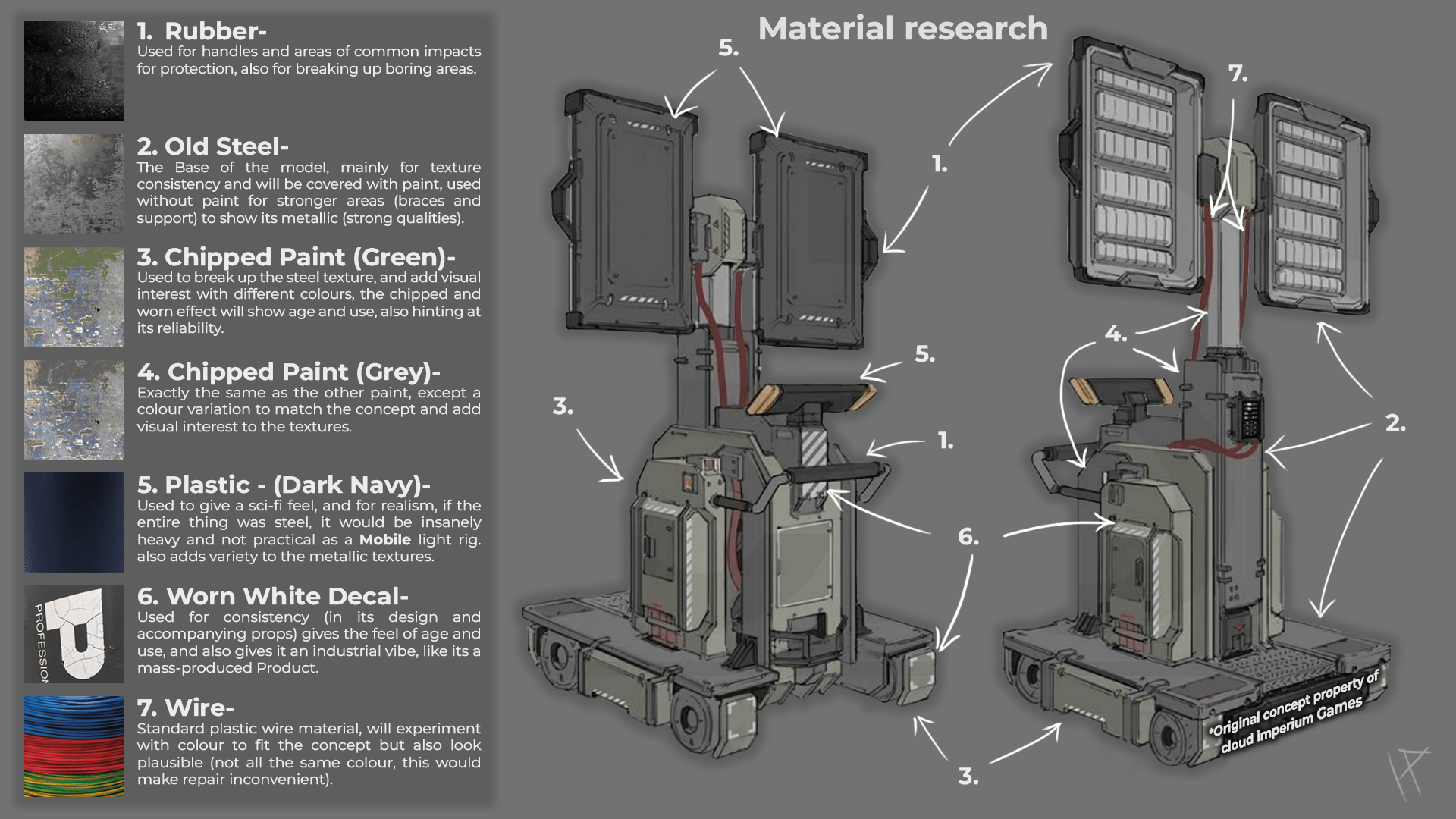
The concept art for the light rig provided a strong foundation for the design but left much of the material detail to interpretation, as it primarily used flat colours with little to no texture information. To bridge this gap, I did some research to understand the types of materials that could fit the design, ensuring they were consistent with the overall aesthetic and functional nature of the the rig.
I started by looking for reference materials online, focusing on industrial equipment and some spacecraft and rovers to get a better sense of how these objects are constructed and finished in real life. This involved studying photographs and online 3D scans, paying attention to surface details like metal wear, paint imperfections, and plastic sheen. Websites like textures.com and sketch fab were invaluable for finding high-quality 3d scans and material reference images. These resources provided insight into how light interacts with different surfaces, which was essential for creating realistic and visually appealing materials.
One key aspect I noticed during my research was the contrast between clean, polished metal and rougher, worn sections where the rig might experience heavy use. This gave me ideas for adding subtle scratches, edge wear, and grime to enhance realism. This research phase not only informed my material choices but also gave me a deeper appreciation for how texture details can transform a flat design into something dynamic and engaging.
After completing the research and planning for the textures, I moved on to the next major step: baking my light rig in Substance Painter. To streamline the project, I created my high-poly version by duplicating the low-poly mesh and adding support edges. This allowed me to smooth the asset easily, creating a high-poly version that wasn’t drastically different from the low-poly model but featured clean, smooth edges. These edges provided the perfect detail for a high-quality bake.
Since my asset included mirrored elements, I needed to take a strategic approach to ensure the bake was clean and free from errors. To address this, I exported a version of my model from Maya that had all geometry with overlapping UV islands deleted. This simplified version of the asset eliminated the risk of baking artefacts caused by overlapping UVs, making the process far smoother and more predictable.
In Substance Painter, I used mostly the default baking settings, which delivered excellent results with minimal adjustments. Substance’s built-in baking tools handled the details effectively, accurately capturing the high-poly geometry's smooth edges and bevels without introducing many noticeable errors. This efficient workflow ensured that the baked maps, particularly the normal and ambient occlusion maps were of high quality, setting a solid foundation for the texturing phase.
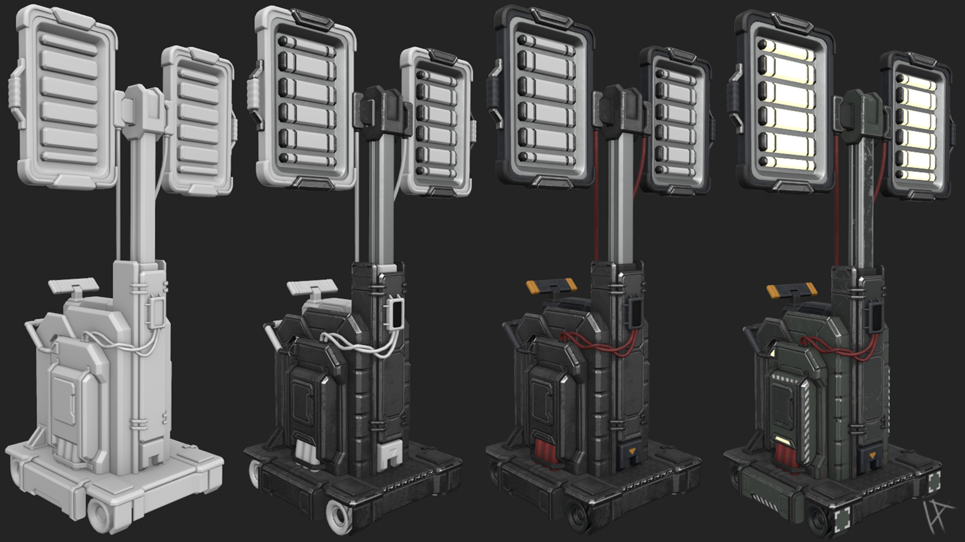
After completing the bake, I moved on to texturing the light rig in Substance Painter. My approach to texturing was fairly methodical, starting with the most prominent material, the steel base, and working my way down through the smaller details and materials. This ensured I could establish the overall feel of the asset before refining the finer elements.
I started by referencing the PBR values database online to get accurate base values for the steel material. This was my foundation, but as I started layering details like edge wear and dirt, I noticed an issue with the normal map. Despite a clean bake, there were areas where the normal map appeared distorted or overly sharp, particularly around some of the bevelled edges. These artefacts didn’t just look out of place, they threw off the lighting on the material, making it seem unnatural and inconsistent.
After a bit of troubleshooting, I discovered that the issue stemmed from overlapping UVs on the mirrored sections of the model. Even though I had handled overlapping UVs carefully during the bake, some of the mirrored areas weren’t perfectly aligned in the UV layout. This misalignment caused the normals to behave unpredictably during texturing.
To fix this, I went back to Maya and adjusted the UV layout, slightly offsetting the mirrored islands to eliminate any direct overlap. I then rebaked the normals in Substance Painter with the adjusted UVs, which resolved the distortion issue. It wasn’t a major overhaul, but it saved the textures from looking awkward and made the asset far more polished.
Once the normal map issue was resolved, I continued building the textures layer by layer. The steel material came to life with a mix of roughness variations, edge wear, and subtle imperfections. For the smaller materials, like the plastic and wiring, I added distinct textures that complemented the steel, ensuring each material felt unique yet cohesive. Substance Painter’s smart masks and procedural tools made it easier to introduce dirt, scratches, and gradients, giving the light rig a sense of history and use.
This technical hiccup with the normal map taught me the importance of double-checking UVs when working with mirrored sections. While it cost me a bit of time, it ultimately improved the final quality of the textures and gave the asset a cleaner, more professional finish.
Finalising the project
Creating Supporting Assets
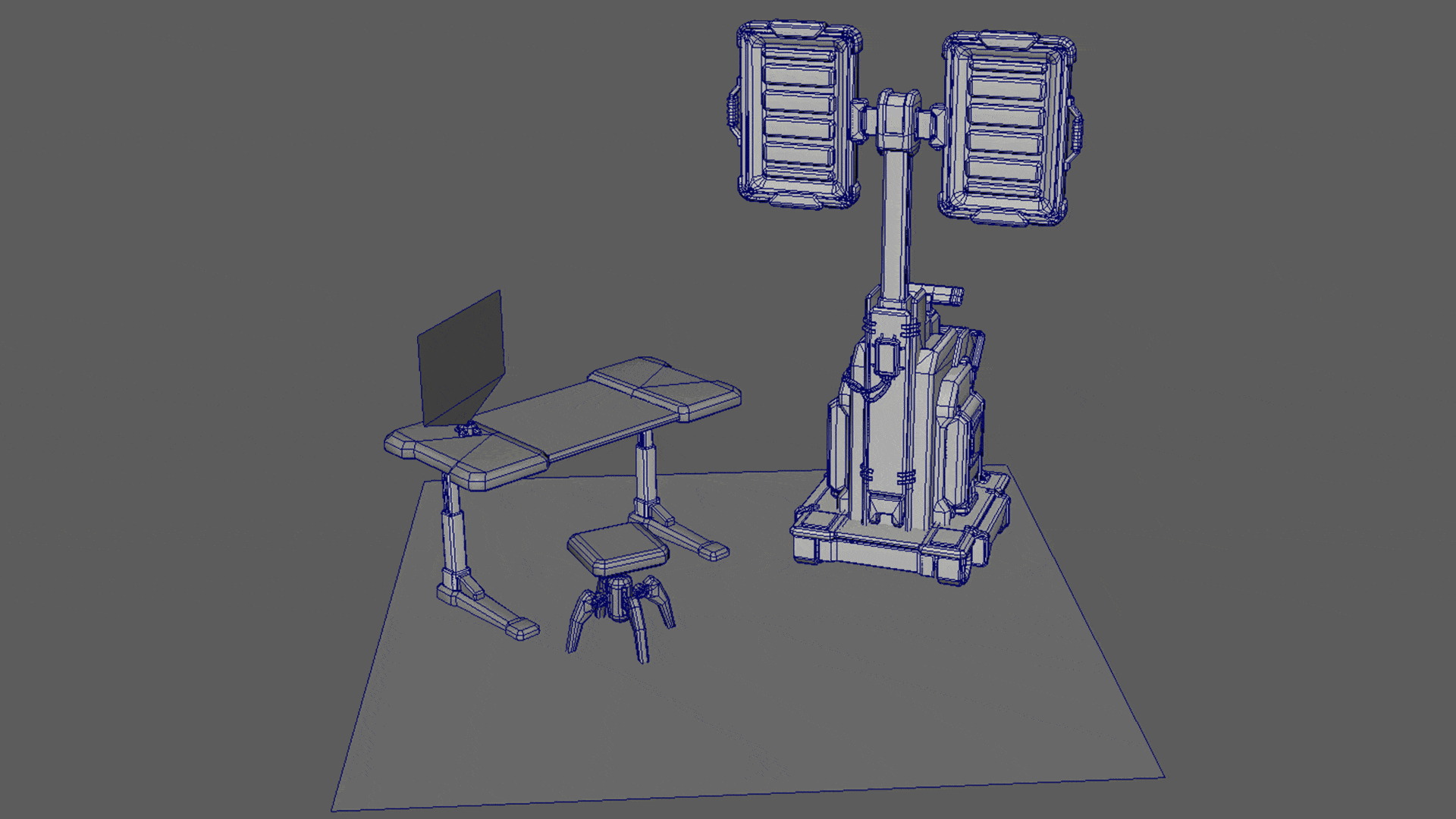
Before bringing the light rig into Unreal Engine 5, I focused on creating a series of supporting assets to complement the presentation and enhance the overall impact of the light rig. These props weren’t just for show, they were designed to sell the scale, functionality, and context of the light rig, making it feel like a key piece of equipment within a larger world.
The first asset I created was a simple tileable floor plane. This provided a clean, modular foundation for the scene, grounding the light rig without stealing focus. Next, I designed a sci-fi toolbox to reinforce the practical, utilitarian vibe of the scene. The toolbox featured slightly worn textures to match the light rig’s aesthetic, suggesting regular use in a high-tech environment.
To add more visual interest and scale, I created a hover stool, a futuristic mechanic’s seat that helped emphasize the human element and size of the rig. Alongside the stool, I modelled simple tools, including spanners and a screwdriver, which were scattered on the stool. These tools further supported the idea that the light rig was actively being worked on or maintained, adding a layer of narrative to the presentation.
One of the most engaging additions was a projection schematic, designed as a holographic display that resembled a page from a repair manual. This element not only tied directly into the sci-fi theme but also provided a striking visual that helped convey the rig’s technical nature and function. By pairing the schematic with the rig, I was able to visually communicate its purpose and significance within the scene. Altogether, these supporting assets didn’t just complement the light rig, they helped sell its scale and functionality, making the scene feel like a cohesive and believable slice of a sci-fi world.
Bringing the Textured Model to UE5
With the supporting assets complete, the next step was to bring the light rig into Unreal Engine 5 and set up a presentation scene. To ensure a smooth transition, I exported the textures from Substance Painter using the UE preset. This gave me optimized maps tailored for Unreal, including a colour map, a packed map (containing metallic, roughness, and ambient occlusion), and a normal map. I also created an emissive channel for the lights, giving them a soft glow that added to their functionality.
After importing the model and textures into Unreal, I set up material instances using the exported maps. The emissive channel played a crucial role in making the lights feel active, while the box lights I placed in front of the emissive areas simulated the actual light output. This combination created realistic highlights and reflections on the surrounding environment, giving the rig a sense of presence and functionality.
With the lighting setup complete, I shifted focus to the overall scene composition. Post-processing adjustments, including subtle reflections and tweaks to contrast and exposure, added a cinematic polish to the final render. I also set up multiple static camera angles to highlight different parts of the model, such as the smooth bevels, worn edges, and intricate wiring. Depth of field helped draw attention to key areas, adding a professional touch to the presentation.
By the end of the process, the light rig was presented in a way that not only showcased its design but also demonstrated its functionality within a cohesive, believable scene.
conclusion
Project Conclusion
This project marked an important milestone in my development as an artist, as it was my first foray into creating a realistic asset. Up until now, my work has been primarily stylized, which felt safe and familiar. I was hesitant to dive into realism, but with this being a relatively small project compared to others I’ve tackled, I saw it as the perfect stepping stone to explore a more realistic approach. Looking back, I’m glad I took the leap, it pushed me to confront new challenges and refine my workflow in ways I hadn’t before.
One of the most valuable aspects of this project was how it pushed me out of my comfort zone. Starting with the technical foundations, like creating a clean mid-poly, hard surface model and optimizing UV layouts—helped me build confidence in tackling realistic projects. I also learned the importance of balancing technical constraints, like staying within the tri-budget, while still achieving the visual fidelity needed for a realistic asset. These challenges taught me that problem-solving is an essential part of the process, often leading to better results than I initially imagined.
To showcase the light rig fully, I created a detailed presentation scene in Unreal Engine 5. This involved setting up dynamic lighting to highlight the rig’s features and adding an emissive channel to make the lights glow realistically. Box lights placed in front of the emissive areas enhanced the effect, giving the rig a functional and polished appearance. The supporting assets, including the hover stool, toolbox, tools, and holographic schematic, not only added context but also helped sell the light rig’s scale and purpose. These props reinforced the scene’s believability and made the light rig feel like an integral part of a larger world.
Looking back, this project was the perfect stepping stone into realism. While I initially felt unsure about stepping away from stylized work, the manageable scope of the project allowed me to focus on learning and refining my workflow without feeling overwhelmed. The problems I faced—shading artefacts, baking issues, and roughness adjustments—were frustrating at times but ultimately rewarding to solve. They gave me a deeper understanding of the technical side of asset creation, as well as the importance of research and iteration.
If I were to revisit this project, I’d explore using decals to break up symmetry and save texture space, which could have added even more detail without compromising performance. I’d also spend more time refining the lighting in Unreal to push the presentation further. Overall, I’m proud of what I achieved. This project has not only expanded my skill set but also given me the confidence to tackle more ambitious, realistic projects in the future.